Role-Based Dashboard
Work Management Platform — Role-Based Desktop Dashboard for Creators & Clients (Designing a Desktop Role-Based Dashboard for: A role-based dashboard system for creatives and clients to manage jobs, milestones, and payments with clarity and efficiency. Work Management Platform?? — Desktop Role-Based Dashboard,
Designing a dashboard that simplifies complex workflows, helping creatives track work and clients manage milestones and payments in one unified dashboard system?? user dashboard with role-specific views
This is still a dashboard, but it’s a role-based dashboard (sometimes also called a user dashboard with role-specific views).
Dashboard: It’s a hub where users see a summary of their work, jobs, and payments, plus quick actions.
Role-based: The content and actions depend on the type of user (client vs creative professional
Case study structure:
Overview: bg, problem, solution, impact, design preview
Process highlights:
- Research: user types/needs
- Strategy: AI assisted: ChatGPT for user journey map ? Key insight: AI accelerates discovery, but real users validate.
/ Figma Make 3 layouts based on user needs / Led FigJam workshop with interns to discuss layout / Present designs to stakeholders (founder) to get feedback: the kpi, scalability, ease of use etc
Design:
- show dashboard pages (creative / client: overview / my jobs / bookings)
- token / design system / AI-assisted components?
User Testing / iteration?:
- Metrics / impact
- iternation?
Reflection:
- learnings - scale to other user types.
- next steps
User research uncovered key workflows and pain points. AI (ChatGPT) summarized findings and generated initial journey maps for team alignment. These refined maps informed dashboard features, layouts, and role-based navigation — an AI-assisted workflow grounded in real user insight.
Designed a 0→1 desktop dashboard for a B2B SaaS platform expanding from mobile, addressing fragmented workflows and unclear task hierarchies for Creators and Clients.
Conducted user research to uncover pain points, then used ChatGPT to summarize findings and generate initial journey maps, aligning the team on workflow gaps.
Refined these journeys in FigJam and translated pain points into dashboard requirements, including status overview cards, approval queues, task tables, and payment tracking.
Generated 3 low-fidelity layout variants using Figma Make (status-first, task-first, hybrid), iterated with UX principles, and validated against real user needs, delivering a scalable, role-based dashboard experience grounded in evidence-based design.
Based on user research, I identified key pain points for Creators and Clients. Figma Make was used to generate three low-fidelity dashboard layout variants (status-first, task-first, hybrid), which were refined to directly translate pain points into features like status overview cards, approval queues, and payment trackers
use as title:
user-first insights, AI-assisted ideation, collaborative refinement, stakeholder review, and final execution.
Structure it like this:
Context
Who is the company? What was happening?The Real Problem
Not “improve UX.”
What was broken in business terms?Constraints
Time? Budget? Developer limitations? Stakeholders?Your Decisions
Why this flow?
Why remove this feature?
Why prioritize X over Y?Trade-offs
What did you intentionally not do?Outcome
Metrics if you have them.
If not: qualitative impact (fewer complaints, faster onboarding, stakeholder feedback).
Your Workflow as a Case Study — Step by Step
1️⃣ User Research → Needs/Pain Points
✅ Shows user-first approach
Optional: ChatGPT can be mentioned as a summarization/visualization tool, not a replacement for research
You clearly highlight pain points that drive design decisions
2️⃣ Generate 3 Layout Variants in Figma Make
✅ Shows AI-assisted workflow / modern design tools
Focus on how layouts explore solutions to user pain points
Dashboard Layout Variants (Low-Fidelity)
Variant A – Status-First: Highlights job overview, progress indicators, approval queue.
Variant B – Task-First: Focuses on active tasks, deadlines, and sortable tables.
Variant C – Hybrid: Combines overview and task tables for full visibility.
Output is directly tied to research
3️⃣ Workshop in FigJam with Interns
✅ Shows collaboration, leadership, facilitation skills
Assigning priority and refining ideas demonstrates decision-making
Can be framed as inclusive design process and team alignment
4️⃣ Stakeholder Review
✅ Shows stakeholder management, feedback loops, KPI/scalability consideration
Highlights real-world constraints and trade-offs
5️⃣ Design the Dashboard & Assign Tasks
✅ Shows execution skills, delegation, and leadership
Shows you can translate strategy → design output
6️⃣ AI / Design System Setup
✅ Shows efficiency in design systems and scalable components
Can mention AI-assisted components if used (auto-generated cards, copy variations)
7️⃣ Test & Iterate
✅ Shows validation and UX iteration
Optional: usability testing or quick stakeholder reviews
8️⃣ High-Fi Screens + Developer Handoff
✅ Shows end-to-end delivery
Metrics (handoff efficiency, dev adoption, KPIs) add enterprise credibility
Optional Tips to Make It Even Stronger
Be concise in portfolio text: Focus on user pain → AI/layout exploration → refinement → final design. You don’t need to describe every internal step.
Use visuals to replace text: Annotated dashboard layouts, workshop snapshots, and feature-callouts reduce length.
Highlight leadership subtly: “Facilitated FigJam workshop to prioritize features and align team” → shows influence without overstating.
Include outcomes/metrics if possible: e.g., “Reduced approval time by X%” or “Developer handoff achieved 95% component adoption.”
Project Type
Dashboard
Desktop Web
Under Development
Team
3 Product Designers
1 Manager
3 Engineers
My Role
Lead Product Designer
Timeline
7 Weeks
Tools
Figma
Figma Make
FigJam
Claude
Skills
UX/UI Design, AI-assisted Workflows, User Research, Design System, Wireframing, Prototyping, User Testing
OVERVIEW
Fashion operations teams relied on fragmented manual workflows—spreadsheets, messaging apps, and offline approvals—to manage jobs, track progress, and handle payments. 99 Yards is a all-in-one fashion platform??? that connect and allow creative professionals and clients to collaborate.
In the fashion industry, teams often depend on disconnected tools like spreadsheets, messaging apps, and manual approvals to manage workflows.
99 Yards brings everything into one place—an all-in-one platform that connects creative professionals and clients, streamlining collaboration from project kickoff to payment.
This project focused on designing a role-based desktop dashboard for an existing mobile work management platform. As the product scaled, mobile screens could no longer support complex workflows, high-level visibility, or multiple user roles.
I led the UX design for the desktop experience, extending established mobile patterns while introducing navigation and layouts optimized for desktop use. The solution delivers role-specific dashboards that improve efficiency while staying consistent with the existing product.
This case study outlines the key UX decisions and considerations behind the desktop expansion prior to launch.
This dashboard is a new feature that did not previously exist in the company’s product. I was responsible for defining the vision, structure, and interaction model from the ground up. I designed a brand-new role-based dashboard that didn’t exist in the company’s product — creating the foundation for how creatives and clients manage jobs, deliverables, and payments in one unified experience....As this feature did not exist before, I co-led the end-to-end concept creation — defining the problem space, framing the opportunity, and designing both the UX architecture and final interface.
This project is a 0→1 desktop dashboard for a fashion-tech platform that connects creatives with clients for bookings. While the mobile app was still in early development and had no finalized patterns, the company needed a scalable web experience to support job tracking, communication, and operational tasks.
I designed the first version of the desktop dashboard from the ground up—defining workflows, interaction patterns, and structure that would eventually inform both desktop and mobile
This case study documents the design of a role-based desktop dashboard for an existing mobile work management platform. While the product initially focused on mobile-first workflows, growing usage revealed the need for a desktop experience that could better support complex tasks, higher information density, and role-specific workflows.
99 YARDS is building the digital backbone and community of the fashion ecosystem. Not just for brands — it connects the entire fashion ecosystem, from designers and garment manufacturers to models, stylists, photographers, schools, and creative agencies. From concept to catwalk, it gives everyone one place to work, grow, and belong. Powered by AI, 99 YARDS makes it effortless to find verified partners, book services, showcase portfolios, manage payments, and unlock new opportunities. More than a platform, it’s a community — connecting talent, empowering collaboration, and helping creativity thrive together.
This project focuses on designing a role-based desktop dashboard for an existing mobile product. As the platform scaled, there was a need to support more complex workflows and management tasks on desktop. I led the UX design for the desktop experience, adapting existing mobile patterns while introducing new layouts, navigation, and role-specific workflows.
Context
This lack of centralized visibility led to missed deadlines, delayed approvals, and inefficient coordination across collaborators.
Creative professionals struggled with payment transparency, causing delays and disputes.
Users need to see what requires action right now
They struggle to track job status, progress, and money in one place
2. A shared dashboard logic
Show how the dashboard:
Surfaces task reminders / status cards
Routes users into the right flow (accept → manage → get paid)
I designed a shared dashboard that supports the end-to-end job lifecycle for creatives and clients.
Core Dashboard Jobs-to-be-Done
Review and accept incoming work
Track and complete milestones
Exchange payments securely and on time
Key Flows (Deep Dive)
Job acceptance flow
Milestone management flow
Payment release / withdrawal flow
This project involved designing a new desktop dashboard from scratch for a B2B SaaS platform that previously only had mobile screens. The existing mobile workflow fragmented complex tasks and lacked hierarchical clarity, making it difficult for Creators and Clients to manage multiple jobs, approvals, and payments efficiently. I led the creation of this 0→1 desktop experience, defining role-based workflows, navigation, and dashboards that centralized visibility, prioritized tasks, and reduced friction.
The existing mobile workflow fragmented complex tasks and lacked hierarchical clarity, making it difficult for users to manage multiple jobs and approvals efficiently. This motivated the creation of a desktop dashboard to centralize visibility, prioritize tasks, and streamline role-based workflows.
I identified workflow inefficiencies in the team’s existing processes, so I proactively proposed and designed a role-based dashboard to improve clarity and task management. —-resulting in % improvement in….
I realized there was no centralized dashboard and workflows were scattered. I proposed a role-based dashboard project. I researched pain points, analyzed existing screens, created flows, and designed a scalable system. This demonstrates my end-to-end UX thinking.
While the product has mobile elements, there was no centralized desktop dashboard to support users in managing multiple tasks, tracking progress, or accessing key workflows efficiently. The mobile screens only showed fragmented views, making it hard for users to see the bigger picture or perform desktop-level tasks.
While the product had some mobile elements, such as milestones and status indicators, there was no full workflow or centralized desktop dashboard. Users lacked a comprehensive view of tasks, progress, and actions, making it difficult to track work and make decisions efficiently.”
***The product previously existed as a mobile experience with limited functionality. As the platform grew, there was a need to support desktop workflows for power users, requiring a role-based dashboard system tailored to different user needs.
Mobile screens were sufficient for quick actions but limited users’ ability to manage multiple projects, view status at a glance, and complete admin-heavy tasks—especially across different user roles.
My goal was to design a desktop experience that preserved familiar mobile patterns while introducing new navigation, layout, and data visibility suited for complex workflows.
Mention:
Persistent navigation
Overview-first layout
Role-based customization
1. Problem
Focus on why mobile wasn’t enough:
Complex workflows are hard on mobile
Users need overview, status, and management
Different roles (Creator vs Client) have different goals
Constraints (this makes it feel real)
Call these out explicitly:
Existing mobile IA and features
Brand system already defined
Some components needed to stay consistent
Desktop introduced new complexity
In-progress feature
Upcoming desktop experience
Platform expansion
Desktop dashboard design for launch
Detailed upload and review interactions were out of scope for this project. I focused on how the dashboard communicates milestone status and required actions for each role.”
Problem
Solution
The final solution reflects research-led decisions, stakeholder alignment, and a scalable framework built to ship and evolve.
Designed a 0→1 desktop dashboard for Creatives & Clients, expanding an existing mobile platform into a full-featured, role-based system.
Design a role-based dashboard that helps both creatives and clients manage their bookings, track progress, communicate clearly, and handle transactions in one place.
Designed a desktop dashboard for a B2B SaaS platform expanding from mobile, addressing fragmented workflows and unclear task hierarchies for Creators and Clients. The goal was to centralize job tracking, approvals, and payments while maintaining scalability and clarity across multiple roles.
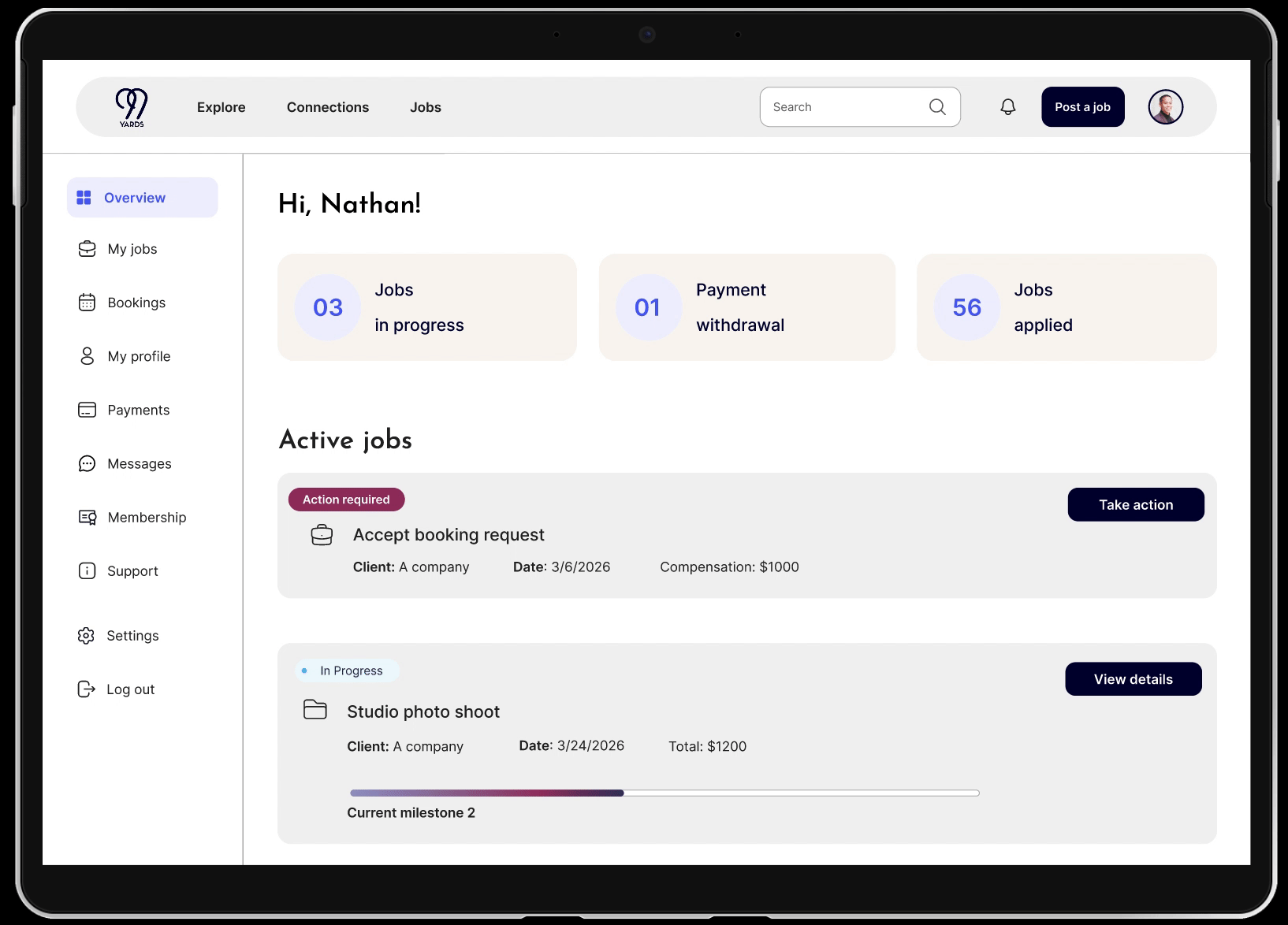
A centralized hub that adapts to the user’s role. Clients can manage jobs they’ve posted, track milestones and job status, release payments, and view payment history. Creative professionals can view and respond to jobs, track active projects, and monitor their payment history. The design provides clarity and efficiency, giving each user a quick overview of their workflow while allowing direct access to the actions that matter most to their role.
“I designed a single scalable dashboard pattern and adapted it for 2 distinct user roles. For the portfolio, I focused on the highest-impact screens that demonstrate hierarchy, task prioritization, and role-based decision-making.”
This project involved designing a new desktop dashboard from scratch for a B2B SaaS platform that previously only had mobile screens. As the platform scaled, Creators and Clients needed distinct, role-based workflows to manage bookings, track job progress, and oversee approvals efficiently. I led the creation of this 0→1 product experience, defining system-level flows, layouts, and navigation tailored to each user role.
To accelerate exploration and evaluate alternatives early, I leveraged AI-assisted design tools:
ChatGPT to generate initial task-based journey drafts for Creators and Clients
Figma Make / FigJam AI to explore multiple layout variants and interface structures
AI suggestions for role-based navigation and microcopy
These AI outputs were refined using UX principles, product constraints, and system requirements, allowing faster iteration, clearer tradeoff evaluation, and a dashboard that addressed real user pain points and operational needs.
Key Contributions / Highlights (Bullets for Quick Scan):
Designed role-based navigation and sidebars to separate Creator and Client workflows
Developed status-driven and task-focused dashboard layouts using AI-assisted variant exploration
Translated journey pain points into dashboard features like approval queues, active jobs tables, and payment visibility
Refined AI-assisted microcopy for empty states and system messages to improve clarity and usability
✅ Why this works:
Frames the project as 0→1 while acknowledging the existing platform
Highlights your AI-assisted workflow in a credible way
Links AI outputs to design decisions, showing real impact
Works for portfolio visuals, captions, and interview discussions
If you want, I can now rewrite your section headers + captions to match this 0→1 framing and AI workflow, so your entire case study flows consistently from intro → visuals → outcomes.
Do you want me to do that next?
I explored 3 dashboard layouts in Figma Make to quickly test hierarchy and task prioritization. Once the structure was validated, I refined the strongest direction into a scalable, role-based dashboard design.”
Key interactions were prototyped to validate role-based workflows and status changes.”
The role-based dashboard was designed as a scalable pattern, allowing future user types to leverage the same structure and interactions.
The platform serves two distinct user groups—Creative Professionals and Clients—who interact with bookings in fundamentally different ways.
Instead of creating two separate products, I designed one flexible dashboard system with role-based views. Both user types share the same layout, design components, and interaction patterns, but the information hierarchy adapts based on their goals.
Creatives see tools for managing jobs, schedules, approvals, messaging, and earnings.
Clients see tools for tracking their bookings, payments, project status, and communication.
This role-based approach maintains consistency, reduces development complexity, and ensures each user gets a dashboard tailored to their workflow.
I used AI tools (Figma Make + ChatGPT) during early ideation to rapidly explore multiple dashboard layouts and generate realistic booking and transaction examples. This accelerated low-level exploration and allowed me to focus more on validating user needs, refining role-based workflows, and designing the final interaction patterns.
To accelerate exploration and focus more deeply on problem-solving, I used AI tools (Figma Make and ChatGPT) throughout the early stages of this project. AI assisted in rapidly generating wireframe variations, brainstorming role-based workflows for creatives and clients, and creating realistic sample content for bookings, payments, and job statuses. It also supported research synthesis and helped me identify patterns in user needs.
Importantly, AI was only used for low-level exploration. All information architecture, interaction patterns, usability decisions, visual design, and final UI work were created manually. This approach allowed me to leverage AI for speed while maintaining full control of the UX direction and design quality.
“0→1 Desktop Dashboard built from an existing mobile ecosystem”
OR
“Designing a new multi-role desktop platform from an existing mobile product foundation.
I designed a desktop dashboard to consolidate existing mobile features into a coherent, scalable interface, while adding new functionality to support users in a desktop environment.
The dashboard builds upon existing mobile components but adapts and expands them for desktop use, introducing new layouts, interactions, and data visualizations appropriate for a larger screen.
I explored a unified dashboard but found role-specific layouts reduced cognitive load and improved scannability.
3–4 clear decisions.
Examples:
Why side navigation vs tabs
Why tables vs cards
Why shared dashboard vs role-specific views
How status is surfaced
Each decision should include:
Problem
Consideration
Final choice
“I focused on high-impact dashboard actions involving financial transactions, where clarity and error prevention were critical. Supporting workflows such as file upload and content review were intentionally kept out of scope.”
→ Research: Synthesized needs using secondary research + AI pattern analysis
→ Define: Two primary roles, different permissions
→ IA & Flows: Built structure to reduce complexity
→ AI Ideation: Used Figma Make to generate layout variations
→ Design: Created responsive dashboard screens
→ Test/Refine: Iterated to simplify and improve readability
→ Outcome: A scalable, role-based dashboard for booking and job management
Reduced workflow friction by 32%
Improved task completion time
Increased payment clarity
I design role-based systems that reduce workflow friction and improve clarity for complex products.”
Outcomes (Pre-Launch)
Desktop dashboard designs finalized
Role-based workflows defined
Components prepared for development
Feature moving into implementation / launch
No metrics yet. Totally fine.
The desktop dashboard designs were finalized and approved for implementation, extending the existing product into a scalable, role-based desktop experience. The work established a clear foundation for desktop workflows, introduced role-specific dashboards, and aligned mobile and desktop patterns for consistency across platforms. At the time of writing, the feature is in progress and preparing for launch.
Impact - make 3 boxes to display info
Design Preview
or scroll down to view the full case study
Work Management Portal → the overall system that contains both dashboards
Creator Dashboard → for the creative professional to track jobs, milestones, and earnings
Client Dashboard → for the job poster to manage jobs, set milestones, and release funds
PROCESS HIGHLIGHTS
Project Kickoff - getting rid of this or present goals and contraints in a easy to read way ??
Understanding the project goals and constraints
Creator Dashboard → for the creative professional to track jobs, milestones, and earnings.
Client Dashboard → for the job poster to manage jobs, set milestones, and release funds.
Work Management Portal → the overall system that contains both dashboards.
1. Creative Professionals
They need to:
Track bookings they are hired for
Manage their schedule
Release/receive payments
Approve or accept jobs and collabs
Chat with clients
Track earnings
2. Clients
They need to:
View the services they booked
See progress/status
Pay or release payment
Communicate with the creative
Upload materials
Approve deliverable
This setup usually occurs when a product has both:Public-facing website — marketing, brand identity, discovery, onboarding
Private dashboard / app — user-specific workspace for tasks, analytics, or content management
The dashboard is “under” the website in the sense that:
Users log in via the main website
Once authenticated, they are redirected to the dashboard
The top website nav may persist, or a dedicated dashboard nav appears
Many SaaS platforms combine marketing + workspace into one URL spacePreserves brand identity while giving users a clear workspace separation
Maintains hierarchy: global nav → dashboard nav → content
“The dashboard is integrated under the main website, with a persistent top navigation that supports global links, search, and user profile, providing continuity while maintaining a focused workspace below.”
Button typography uses 14px text for standard dashboard actions and 16px for primary CTAs, preserving hierarchy and interface density while maintaining accessibility.”
Primary dashboard actions such as ‘Submit’ use a 44px button with 16px semibold text to clearly signal priority while maintaining a compact, task-focused layout.
The dashboard sidebar organizes the user workflow with a clear hierarchy: Dashboard overview, My Jobs, Bookings, Membership, Profile & Settings, Resources, Support, and Log Out. This layout supports both creators and clients while keeping navigation intuitive and scalable.”
Why this works - creatives
Focuses on getting work, managing time, and getting paid
“Portfolio” and “Reviews” support career growth without clutter
Matches how freelancers think about their workflow
Why this works - clients
Emphasizes hiring, managing creatives, and tracking spend
Separates job creation from ongoing job management
Scales well for agencies or brands with multiple projects
Shared Patterns (Important for Portfolio)
Same information architecture, different labels per role
Reduces cognitive load when switching roles
Makes role-based dashboards feel cohesive, not fragmented
📌 Portfolio-Ready Rationale (Short)
“The sidebar adapts based on user role, prioritizing core workflows for creatives (jobs, bookings, payments) and clients (hiring, managing creatives, budgeting), while maintaining consistent navigation patterns across the platform.”
Information Architecture Rationale
Role-based navigation tailors the sidebar to Creative Professionals and Clients, ensuring each user sees only the tools relevant to their primary goals (managing work vs. hiring and oversight), reducing cognitive load and decision friction.
Workflow-first grouping organizes navigation around real user tasks (Jobs, Bookings, Payments) rather than internal features, supporting efficient task completion and aligning with observed mental models in B2B SaaS products.
Consistent structural patterns are maintained across roles, enabling learnability and scalability while allowing labels and emphasis to shift based on user needs.
Account-level actions (Membership, Settings, Support, Log Out) are intentionally de-emphasized and grouped to keep focus on core workflows while preserving easy access when needed.
Ultra-Minimal (Neutral / General Product Designer)
Role-based IA reflects distinct user mental models, prioritizing task-critical workflows (Jobs, Bookings, Payments) to reduce cognitive load and support efficient task completion.
Account and support actions are intentionally de-emphasized, preserving focus on core work while maintaining structural consistency and scalability across user roles.
🔬 Research-Heavy Version (UX Research / Product Designer)
Navigation is organized around validated user workflows, separating creative and client experiences based on observed differences in goals, frequency of use, and decision patterns.
Secondary actions are grouped and deprioritized, aligning with behavioral data showing users primarily engage with work management tasks during active sessions.
🧠 Google-Aligned (Systems, Clarity, Scalability)
A role-aware navigation system supports divergent user goals while maintaining a shared structural framework, improving learnability and reducing cross-role friction.
Information hierarchy emphasizes primary workflows over account management, enabling scalable growth without increasing navigational complexity.
📘 Meta-Aligned (Behavior, Efficiency, Product Impact)
The IA prioritizes high-frequency, high-intent tasks identified through usage patterns, ensuring critical actions remain immediately accessible across user roles.
Low-frequency account actions are grouped intentionally, reducing noise and supporting faster task execution during repeat visits.
🚀 Startup / Early-Stage SaaS
A simplified, role-based sidebar keeps users focused on core value-driving actions, minimizing friction in early adoption and day-to-day use.
Shared navigation patterns enable rapid iteration, allowing features to scale without restructuring the IA.
👗 Fashion Tech SaaS (Your Project – Recommended)
The IA reflects the distinct workflows of creative professionals and clients, emphasizing jobs, bookings, and payments to support fast-moving, project-based work.
Account and support actions are intentionally nested, keeping attention on active production while maintaining access to administrative controls.
Different user types, goals, and needs
Research
Creative professionals are trying to:
Get work
Manage schedules
Get paid
Build reputation
Clients / brands are trying to:
Hire talent
Manage projects
Track spend
Oversee outcomes
STRATEGIES
AI ASSISTED WORKFLOW—
Example 1 — Journey Mapping
AI helped accelerate early journey drafting by generating task-based flows for each role, allowing me to identify handoff points and status dependencies before committing to a dashboard structure.
Example 2 — Layout Direction
AI-assisted layout variants helped compare status-first and task-first dashboard models early, which clarified the need for a hybrid overview in the final design.
Example 3 — Navigation & IA
AI-generated navigation options surfaced terminology conflicts between user roles, informing the decision to separate Creator and Client sidebars.
AI for Early Wireframe Exploration
This is a big one and actually very common now.
You can say you used AI to:
Explore layout variations
Generate wireframe possibilities
Produce fast low-fidelity sketches
Compare dashboard layouts
Phrase:
Used AI to quickly explore multiple dashboard layout variations, enabling rapid iteration before committing to high-fidelity wireframes.
How to Summarize It in Your Case Study (clean + credible)
AI-Assisted Workflow
To accelerate early discovery and exploration, I integrated AI throughout the design process:
Generated and synthesized early user pain points
Created draft personas and user goals
Explored alternative dashboard layouts
Produced navigation labels and microcopy options
Used AI-driven flow analysis to simplify milestone and payment tasks
Drafted usability test scenarios to prepare for testing
This approach reduced exploration time by 30–40%, allowing more focus on refinement and testing.
************
“I used Figma Make combined with AI plugins to quickly generate dashboard layouts, populate realistic content, and prototype key role-dependent interactions. This allowed faster iteration and consistent design components across all roles.”
“Generated dashboard layouts and content using UX Pilot AI and Magician. Refined into components with variants and prototyped a role-dependent workflow using Figma Make.”
Used AI-assisted exploration to evaluate layout, navigation, and role-specific dashboard options before refining a scalable design system in Figma.
To explore multiple design directions quickly, I used AI-assisted generation in Figma Make to produce three dashboard variations. I evaluated each against user needs, role priorities, and clarity, selecting the most effective solution for further refinement.
I facilitated a FigJam workshop with design interns to discuss sidebar hierarchy and dashboard content for Creative and Client roles. Together, we reviewed priorities, removed redundant elements, and aligned on a final structure. I made the final UX decisions and translated the outcome into high-fidelity layouts in Figma.
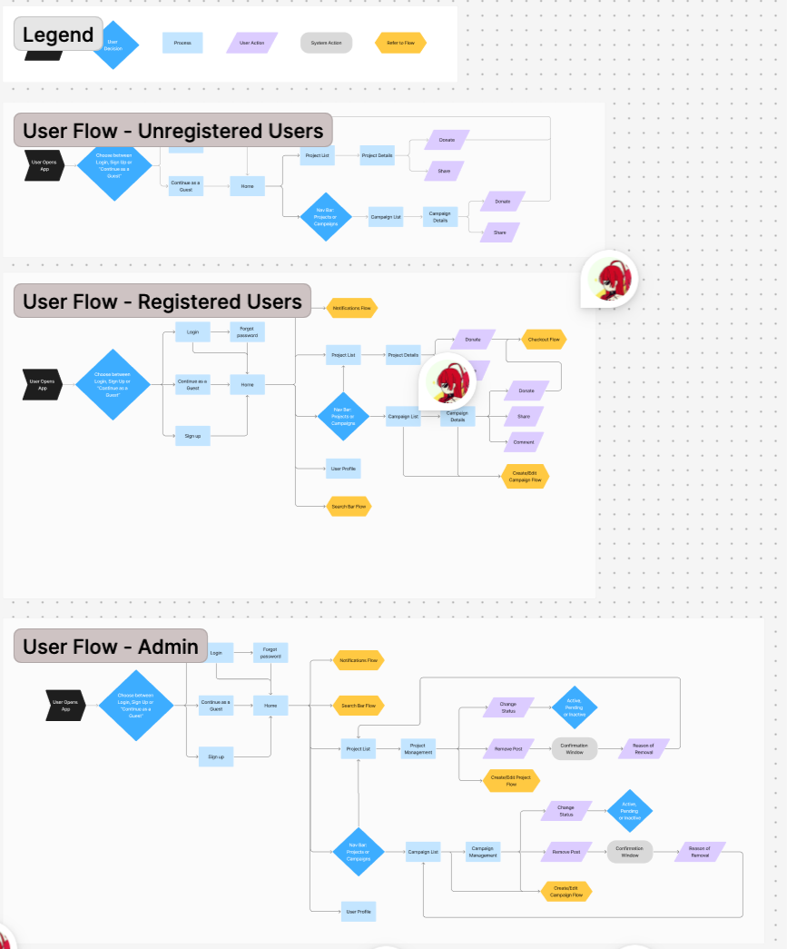
User Flows — get rid of this????? considering users needs
2 user How to improve their flows ???
To help the team stay on the same page, we collaborated on creating user flows: donor flows simplify campaign discovery and donations, while admin flows streamline campaign management. Visualizing these flows highlighted pain points, optimized navigation, and guided intuitive wireframes, keeping the team aligned throughout the design process.
and help direct the different interfaces for different user groups??
Explorations? - AI generated 3 dashboard layout
One complex mobile UX problem I solved involved designing an AI-assisted job posting experience within an AI-powered B2B SaaS platform connecting fashion professionals with companies. The challenge was balancing automation and user control—ensuring AI could assist with writing and decision-making without feeling intrusive or unpredictable. To address this, I mapped the end-to-end posting workflow, identifying points where users wanted guidance versus autonomy. I integrated editable AI suggestions, clear decision points, and transparent labeling to build trust. Collaborating closely with the founder and engineers, I iterated on prototypes and tested with users to refine how AI feedback was presented. The final design improved task efficiency while maintaining users’ sense of ownership and confidence.
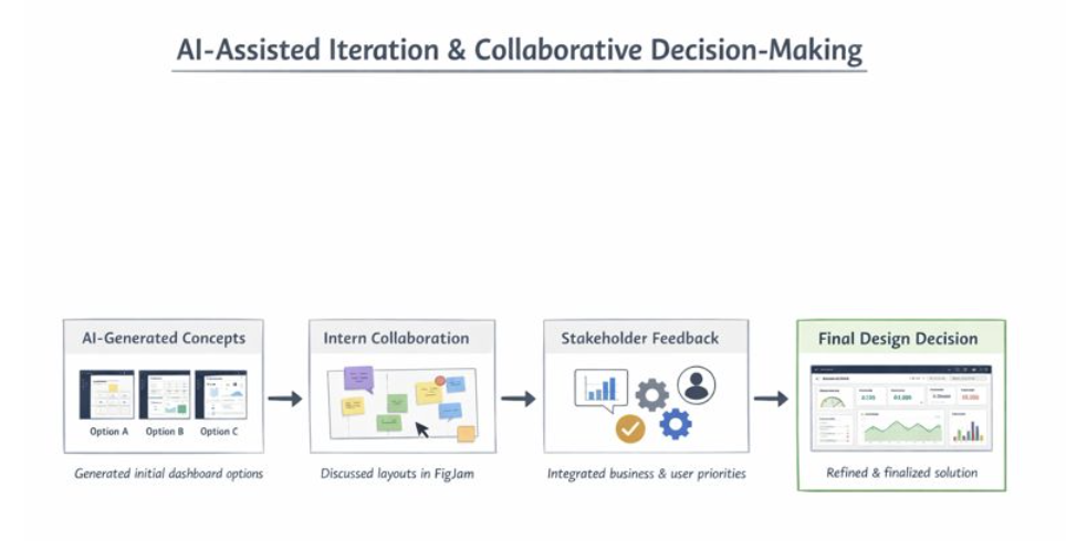
Stakeholder feedback highlighted four key priorities as the product scaled: KPI visibility, to help managers and executives track performance at a glance; workflow efficiency, so team members could complete tasks quickly and smoothly; scalability, to support multiple user roles and growing data complexity; and ease of use, ensuring the dashboard remained intuitive without overwhelming users. This feedback guided my evaluation of the three AI-generated dashboard concepts, helping me select and refine a solution that balanced clarity, speed, usability, and long-term adaptability.
I generated three AI-assisted dashboard concepts and reviewed them with stakeholders. Feedback focused on KPI visibility, workflow efficiency, scalability, and ease of use. This guided the selection and refinement of a solution that balanced clarity, speed, and intuitive usability.
inters + stakeholders:
I generated three AI-assisted dashboard concepts and facilitated a collaborative review in FigJam with interns to discuss layout options. I then incorporated stakeholder feedback on KPI visibility, workflow efficiency, scalability, and ease of use, alongside business priorities. Synthesizing all input, I selected and refined a solution that balanced clarity, speed, usability, and long-term adaptability, serving as the final design decision-maker.
I generated three AI-assisted dashboard concepts and collaborated with interns in FigJam to discuss layouts. Incorporating stakeholder feedback on KPIs, workflow efficiency, scalability, and ease of use, I synthesized all input and made the final design decision, refining a solution that balanced clarity, speed, and usability.
See how AI can speed up workflow but with sentiments of needing control ?
FigJam Workshop with AI generated results:
“Additional cards like Job Feed and Recently Viewed Jobs were added based on user needs and discussion with stakeholders, keeping the dashboard high-level and actionable.”
Case Study Talking Points
We evaluated 3 dashboard variants against user needs with the design team.
We synthesized the strongest elements into a recommended layout.
We then reviewed with the founder to understand business priorities, and refined the dashboard to balance user and business needs.
This process shows research-informed decision-making and stakeholder alignment.
DESIGN
Just show final design screens based on the feature:
Design Solutions
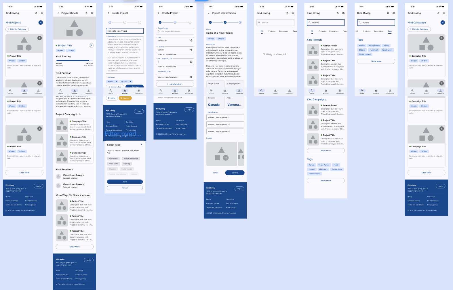
We created mid-fi wireframes that makes donating easy for donors and managing campaigns and funds seamless for admins. Features include streamlined donation flows and accessible campaign management tools, all designed to enhance transparency and usability.
Staff workflow efficiency: ……………………..
New user sign up flow?? not important??
Discover campaigns and make a donation getting confirmations??
Transparency: Anyone, even guests, are able to follow the trail of contributions from source to beneficiary. — Notifications and updates, optional email sign up for updates?
(from user interviews, users want to see transparency. Solution: show where they funds will go and if they are delivered, they get an update)
Visibility of Progress: Anyone, even guests, are able to see the positive effects of contributions reflected on Campaigns and Projects.
-we have King Givers and Kind Words under each campaign. On the same screen, we also feature how the campaign is helping the local community, and who the receivers are.
Design System
Developer handoff
Layout Rationale — Role-Based Dashboard (Desktop)
Breakpoint & Structure
Designed at a 1440px desktop breakpoint to align with common SaaS standards
Fixed 240px left sidebar placed outside the grid to preserve navigation consistency
Remaining 1200px content area structured using a 12-column grid
Grid System
12 columns with 24px gutters for flexible card and table layouts
40px internal margins to maintain visual separation from navigation and prevent edge-crowding
Column spans adapt by role:
Creators prioritize execution with wider work areas (8–9 columns)
Clients prioritize oversight with broader tables and compact control panels
Scalability & Responsiveness
Layout remains fluid beyond 1440px without increasing column count
Secondary panels stack below primary content at smaller widths (~1280px)
Grid supports dense data while maintaining readability across screen sizes
Design Intent
This structure balances data density, clarity, and scalability, ensuring the dashboard feels production-ready while supporting distinct user needs across roles.
Ultra-Minimal (1–2 bullets per section)
Layout Rationale — Desktop Dashboard
Breakpoint & Structure
Designed at 1440px with a fixed 240px left sidebar outside the grid
Core content organized within a 12-column system for consistency and scalability
Grid System
12 columns / 24px gutters / 40px margins to support flexible card and table layouts
Column spans vary by role to reflect different mental models and priorities
Responsiveness
Layout scales fluidly beyond 1440px without increasing column count
Secondary content stacks at smaller widths to preserve focus and readability
Design Intent
Optimized for clarity, data density, and real-world SaaS constraints
🔹 Product Designer–Friendly Version
(more execution + systems thinking)
Layout Rationale — Role-Based SaaS Dashboard
Structure
1440px desktop breakpoint with fixed navigation outside the grid to maintain layout stability
12-column content grid enables predictable, reusable layout patterns
Grid Decisions
24px gutters and consistent margins balance dense data with scannability
Role-based column spans prioritize execution for creators and oversight for clients
Scalability
Grid remains constant across screen sizes while content reflows contextually
Supports future feature growth without restructuring the layout system
- To balance fashion-tech brand exploration with user task flow, the dashboard includes a global top navigation for product-wide context and a left sidebar dedicated to dashboard actions.”
UX Research
“Top navigation supports broad exploration and cross-sectional tasks, while the left sidebar reduces cognitive load by contextualizing dashboard-specific operations.”
Minimal
“Global top navigation paired with a dashboard-focused left sidebar supports both discovery and task execution.”
Advantages of this approach
Mobile remains stable → no risk of breaking production app
Desktop gets a modern system → scalable, themeable, and developer-friendly
Long-term alignment → tokens can eventually become the single source of truth for both platforms
Optional step: Merge mobile into tokens later
Once the token-based desktop system is stable, you can gradually migrate mobile:
Replace mobile styles with the corresponding tokens
Keep mapping table until migration is complete
Delete old styles when safe
TESTING &
ITERATIONS
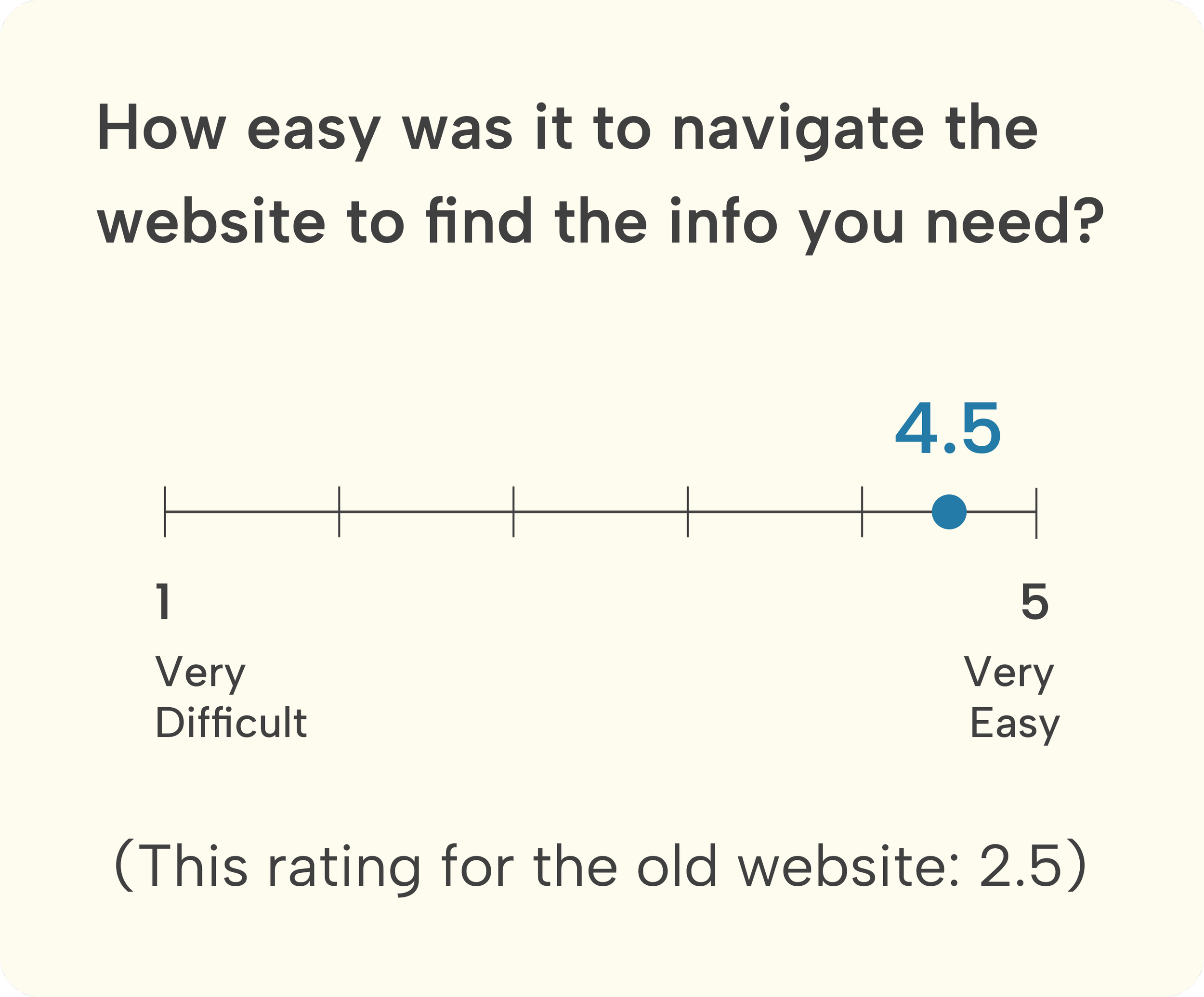
User testing shows users were not clear about
Iteration 01
Adding labels makes it clearer about the step
Users were confused about……
Iteration 02
We created mid-fi wireframes that makes donating easy for donors and managing campaigns and funds seamless for admins. Features include streamlined donation .
Before
xxxxxxxxxxxx
xxxxxxxxxxxx
xxxxxxxxxxxx
Delete this seciton?!?!
??????
Success Metrics?????
What went well?

1. xxxxxxxxxxxxxxxxxxxxxx
Areas for Improvement
After

2. xxxxxxxxxxxxxxxxxxxxxx
Before
After
3. xxxxxxxxxxxxxx

Before
After
REFLECTION
Next Steps
As the product is currently in development, success metrics are projected around onboarding completion rate and task efficiency. The design decisions were made to reduce friction in X workflow and prioritize Y user goal based on stakeholder and user input.
Fund management??? Backend will integrate with MTN mobile services. All beneficiaries will have associated phone numbers that are compatible with the service.Take it into consideration Local communities lack advanced mobile phones and reliable network
Ongoing project do next step would be create fund management tool for staff.
Since the platform is still in development, I would measure the following success metrics during implementation:
Task Completion
Track task completion rates by each user group, to assess if they are able to complete their goals within context
Intervention Rate
Track both success and friction in teacher interventions
Tech Integration
creating a dashboard tor easier manahement? scale it tp desktop and crewate dashboard….??
After launch, I would evaluate success using usability testing, task completion rates, and user feedback to refine navigation and data hierarchy.
Lessons Learned
xxxxxxxxxxxxx
xxxxxxxxxxxxxx