AI-Assisted Job Posting Experience
0→1 Product, Dual job posting workflows, balancing speed, user control, and trust in a B2B SaaS platform.

Overview:
problem statement/solution/impact & metrics
design overview / interactive gifs
Process Highlights:
✔ research insights
✔ two user needs-> duel flow
✔ design strategies/ a/b testing
Design:
✔ (AI + manual) wireframe rationale
test/iterate?:
✔ impact & metrics
✔ reflection / next steps
++++ If AI is faster, why not remove manual?
Project Type
B2B SaaS
Mobile App
www.99Yards.app
Team
1 Product Designer
1 Project Manager
3 Engineers
Timeline
7 Weeks
Tools
Figma
FigJam
Skills
UX/UI Design, Research, Design System, A/B Testing, Wireframing, Prototyping, User Testing
OVERVIEW
99 Yards, a fashion tech company offering an AI-powered B2B SaaS platform that streamlines sourcing, bookings, and professional networking for creative professionals and companies.??? revise
Background
MCF lacked a digital platform to streamline campaign creations, management, and donor contributions. Staff faced inefficient workflows, and global donors struggled to easily contribute to the causes they care about.
Problem
Solution
Estimated Impact
20% New Beta User Signups
80% of User's Time Saved by the app
90% of Users found it easy to use and navigate
I was brought on as the sole designer. Designed and developed Kind Giving, a social-impact web app that streamlines campaign creation, simplifies management, and enables secure donations, improving staff workflow efficiency and user engagement.,
Designing Dual Flows for Manual and AI-Assisted Creation,
AI-assisted flow → for users who want speed
Manual flow → for users who want full control
Why duel flow?
Forcing users into AI creates mistrust. Giving users a choice increases adoption while still delivering efficiency benefits.”
Impact - make 3 boxes to display info
Design Preview

or scroll down to view the full case study
Accessible and reliable donation experience for global donors. (Transparency?)
Launch a new campaign with a funding goal to support local underserved communities
Efficient and seamless campaign management for administrative staff
PROCESS HIGHLIGHTS
Research
Understanding the project goals and constraints
User Research Insights
Through interviews with recruiters and hiring managers, I uncovered two distinct patterns in how users prefer to create job postings. These insights shaped the decision to design two parallel flows that support their different mental models and comfort levels with AI.
User Group A: “Speed Seekers”
These users prioritize efficiency and want to get a job posting out as quickly as possible.
They shared that:
They want a draft created quickly without starting from scratch
They prefer light editing over heavy writing
They often need the ability to regenerate sections when AI output isn’t perfect
Opportunitiy: This group is highly receptive to AI assistance as long as editing remains easy and transparent.
User Group B: “Control Seekers”
These users value accuracy and precision over speed.
They expressed that:
They prefer to write everything manually to maintain tone and compliance
They don’t fully trust AI with nuanced or sensitive job requirements
They often need precise and industry-specific phrasing, especially in legal or technical roles
Opportunity: This group benefits from a traditional, full-control manual flow with clear structure and guidance.
Different user types, goals, and needs
Research
User group A: “Speed Seekers” Want a draft created quickly Don’t want to type from scratch Want easy regeneration when AI output isn’t perfect
User group B: “Control Seekers” Prefer writing everything themselves Don’t fully trust AI Need precise wording for legal or industry reasons
Users appreciated having two clear options at the start, allowing them to choose the method that fits their working style. Users felt more in control because the system didn’t force AI on them. Offering two separate flows increased trust and adoption.
measurable
4/5 users said they liked having a choice between AI-assisted and fully manual creation rather than being forced into a single method.
Impact-focused
Providing two distinct flows helped reduce friction and made the tool feel adaptable to different preferences.
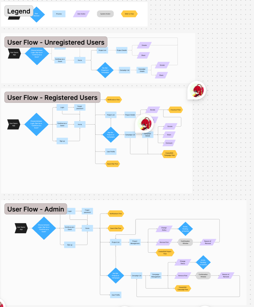
User Flows — get rid of this????? considering users needs
2 user How to improve their flows ???
The platform supports two parallel workflows: AI-assisted for Speed Seekers, and Manual for Control Seekers. Each workflow has 5 steps from input to final posting.??
Design Strategies
Design Implication
Based on these user needs, I designed two tailored job posting flows:
AI-Assisted Flow for Speed Seekers
Manual Flow for Control Seekers
This approach ensures flexibility and increases adoption by meeting users where they are—whether they want fast AI assistance or complete editorial control.One complex mobile UX problem I solved involved designing an AI-assisted job posting experience within an AI-powered B2B SaaS platform connecting fashion professionals with companies.
The challenge was balancing automation and user control—ensuring AI could assist with writing and decision-making without feeling intrusive or unpredictable. To address this, I mapped the end-to-end posting workflow, identifying points where users wanted guidance versus autonomy.
I integrated editable AI suggestions, clear decision points, and transparent labeling to build trust. Collaborating closely with the founder and engineers, I iterated on prototypes and tested with users to refine how AI feedback was presented. The final design improved task efficiency while maintaining users’ sense of ownership and confidence.
See how AI can speed up workflow but with sentiments of needing control ?
DESIGN &
INTERATIONS
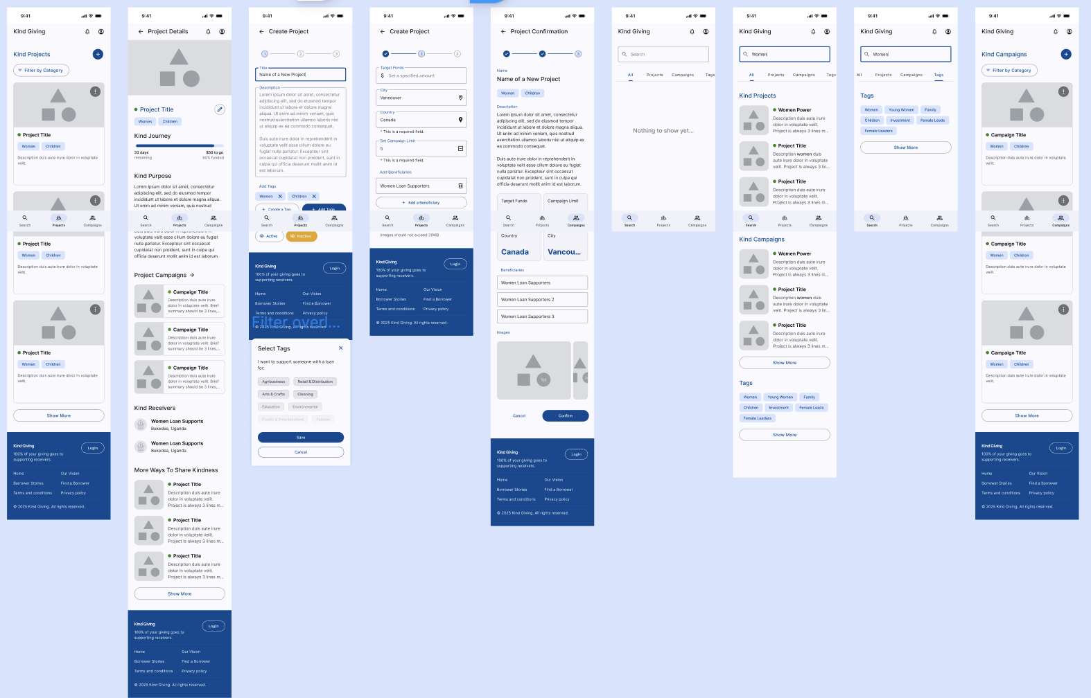
Just show final design screens based on the feature:
Design Solutions
We created mid-fi wireframes that makes donating easy for donors and managing campaigns and funds seamless for admins. Features include streamlined donation flows and accessible campaign management tools, all designed to enhance transparency and usability.
Staff workflow efficiency: ……………………..
New user sign up flow?? not important??
Discover campaigns and make a donation getting confirmations??
Transparency: Anyone, even guests, are able to follow the trail of contributions from source to beneficiary. — Notifications and updates, optional email sign up for updates?
(from user interviews, users want to see transparency. Solution: show where they funds will go and if they are delivered, they get an update)
Visibility of Progress: Anyone, even guests, are able to see the positive effects of contributions reflected on Campaigns and Projects.
-we have King Givers and Kind Words under each campaign. On the same screen, we also feature how the campaign is helping the local community, and who the receivers are.
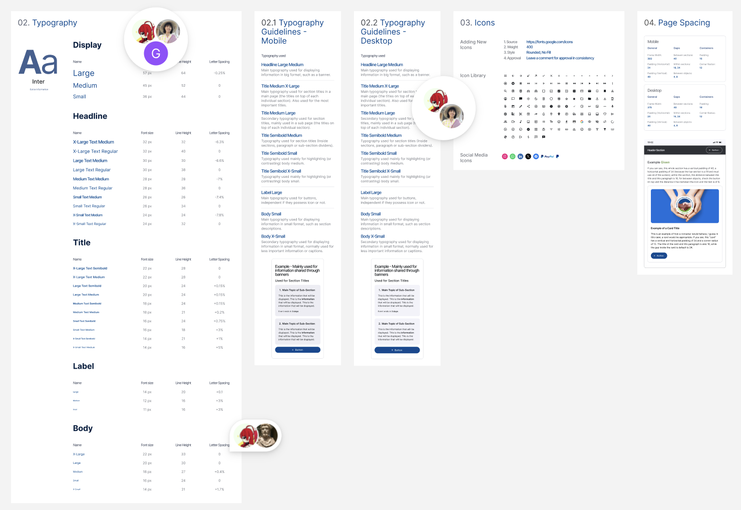
Design System
Developer handoff
Show collaborations!! Collaborating communicating across different time zones
The team uses an existing UI design kit (material design)
Met with developers, designers, manager weekly.
Orgnaize the design system
straight inconsistency with former components, ???
Design System & Accessibility
Defined a token-based design system with a consistent color palette, typography scale, and button styles across the UI. Standardized reusable components—including home banners, CTA buttons, and content cards—to improve visual consistency, efficiency, and hierarchy. The system was built in alignment with WCAG 2.1 AA guidelines, ensuring sufficient color contrast, minimum touch target sizes (44px+), and clear focus states to support an inclusive and accessible user experience.
TESTING &
ITERATIONS
User testing shows users were not clear about
Iteration 01
Adding labels makes it clearer about the step
Users were confused about……
Iteration 02
We created mid-fi wireframes that makes donating easy for donors and managing campaigns and funds seamless for admins. Features include streamlined donation .
Time to Complete Job Posting
Manual flow: ~12–15 minutes
AI-assisted flow: ~7–9 minutes
→ ≈ 30–40% faster
User Satisfaction
(Example you can claim after small testing)
4/5 users said the AI flow helped them start faster
3/5 said they still prefer manual for accuracy — validating the need for both flows
Quality & Consistency Metrics
AI ensures all posts use a consistent structure
Manual users benefit from clear templates
Adoption & Flexibility
Offering dual paths reduces resistance to AI features
Users feel in control instead of forced
Before
xxxxxxxxxxxx
xxxxxxxxxxxx
xxxxxxxxxxxx
Delete this seciton?!?!
??????
Success Metrics?????
What went well?

1. xxxxxxxxxxxxxxxxxxxxxx
Areas for Improvement
After

2. xxxxxxxxxxxxxxxxxxxxxx
Before
After
3. xxxxxxxxxxxxxx

Before
After
REFLECTION
Next Steps
Fund management??? Backend will integrate with MTN mobile services. All beneficiaries will have associated phone numbers that are compatible with the service.
Take it into consideration Local communities lack advanced mobile phones and reliable network
Ongoing project do next step would be create fund management tool for staff.
Since the platform is still in development, I would measure the following success metrics during implementation:
Task Completion
Track task completion rates by each user group, to assess if they are able to complete their goals within context
Intervention Rate
Track both success and friction in teacher interventions
Tech Integration
creating a dashboard tor easier manahement? scale it tp desktop and crewate dashboard….??
Lessons Learned
xxxxxxxxxxxxx
xxxxxxxxxxxxxx