
Delivered a UX-driven redesign of SundaeDoll’s e-commerce website, enhancing navigation, usability, and boosting customer trust by 82%.
Team
3 Product Designers
3 Engineers
Client Project
Client: VanTech Med
Shipped
Tools
Figma
FigJam
Otter.ai
Timeline
5 Weeks
Skills
UX/UI Design, Heuristic Evaluation,User Research & Interviews, Ideation, IA, Design System, Wireframing, Prototyping, User Testing
OVERVIEW
SundaeDoll (formerly Sunny) is an AI-powered doll by VanTech Med designed to help reduce social isolation among the elderly. Its e-commerce site had low engagement and conversions due to cluttered design, confusing navigation, poor usability, and weak trust signals.
Background
Users struggled to navigate the website, access product details, and complete tasks such as adding items to the cart, while a lack of trust signals lowered purchase confidence.
Problem
I led a UX-driven website redesign, improving navigation, information architecture, and usability while building customer trust.
Solution
Impact

Design Preview (Before & After)
or scroll down to view the full case study
RESEARCH
Project Kickoff
Our kickoff meeting clarified the client’s goals - increasing engagement, trust, and conversions, while noting stakeholders’ perspectives on the current website.
Understanding the client’s business goals and perspective on the existing website
Existing usability issues & solutions
Heuristic Evaluation
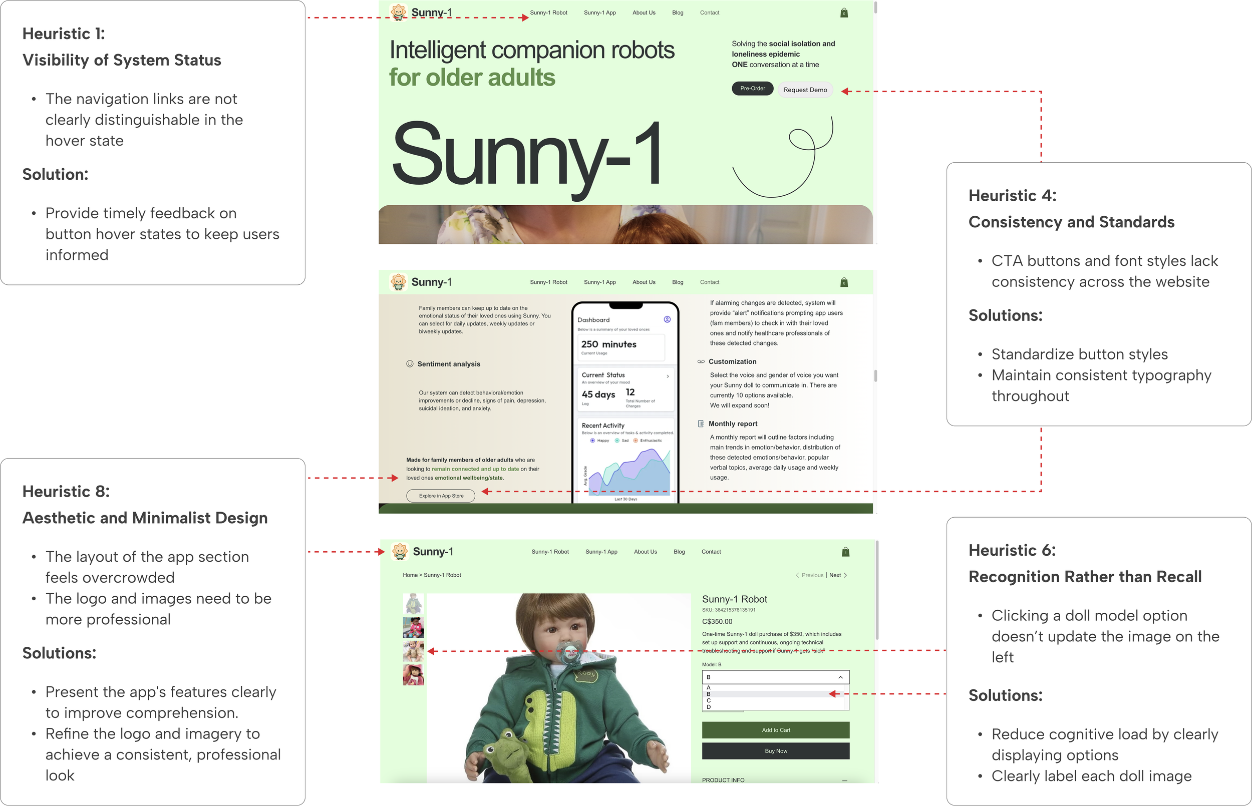
We conducted a heuristic evaluation using Nielsen Norman’s 10 usability principles to uncover key design issues. I led a workshop and presented the findings and solutions to align stakeholders and drive a usability-focused redesign.
Conducted the startup’s first user interviews for the website and identified 4 key areas for improvement
User Interviews
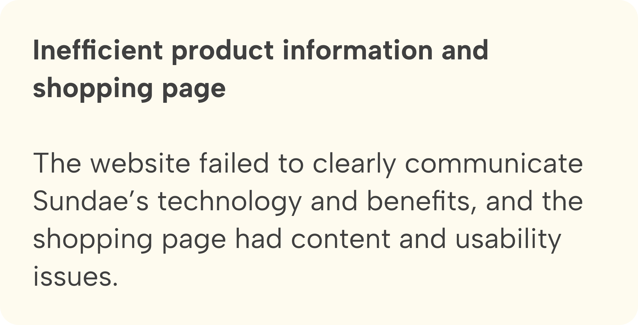
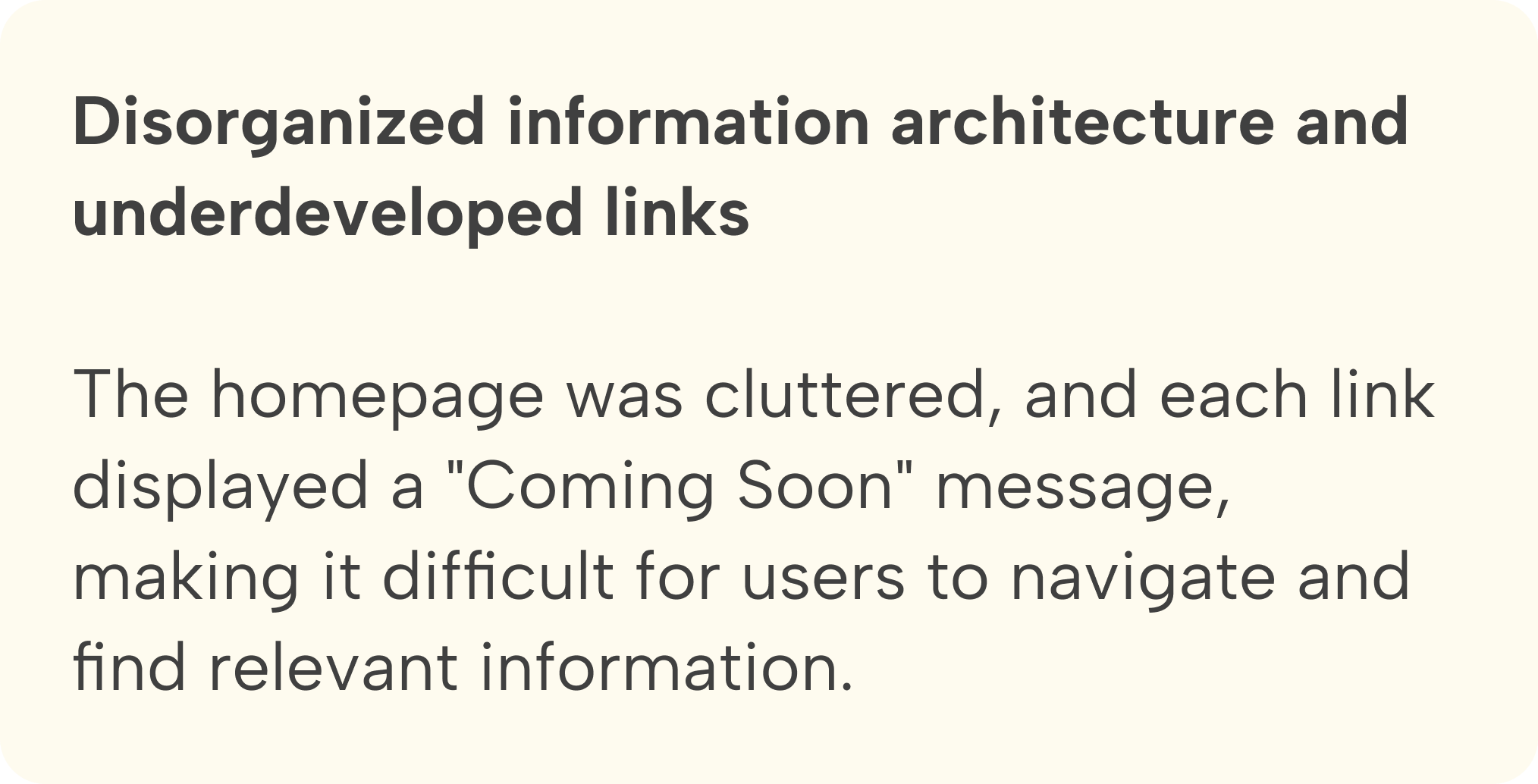
To understand why the site was hindering engagement and sales, we interviewed six potential customers, then conducted affinity mapping and identified 4 key areas for improvement:
1. Design
2. Content & organization
3. Shop page
4. Building trust and credibility

DEFINE
Target Users
Helping families stay connected to their seniors

Our target users are mainly family members of seniors who can’t always be physically present with their loved ones and are seeking reliable solutions for companionship and convenient ways to stay connected.
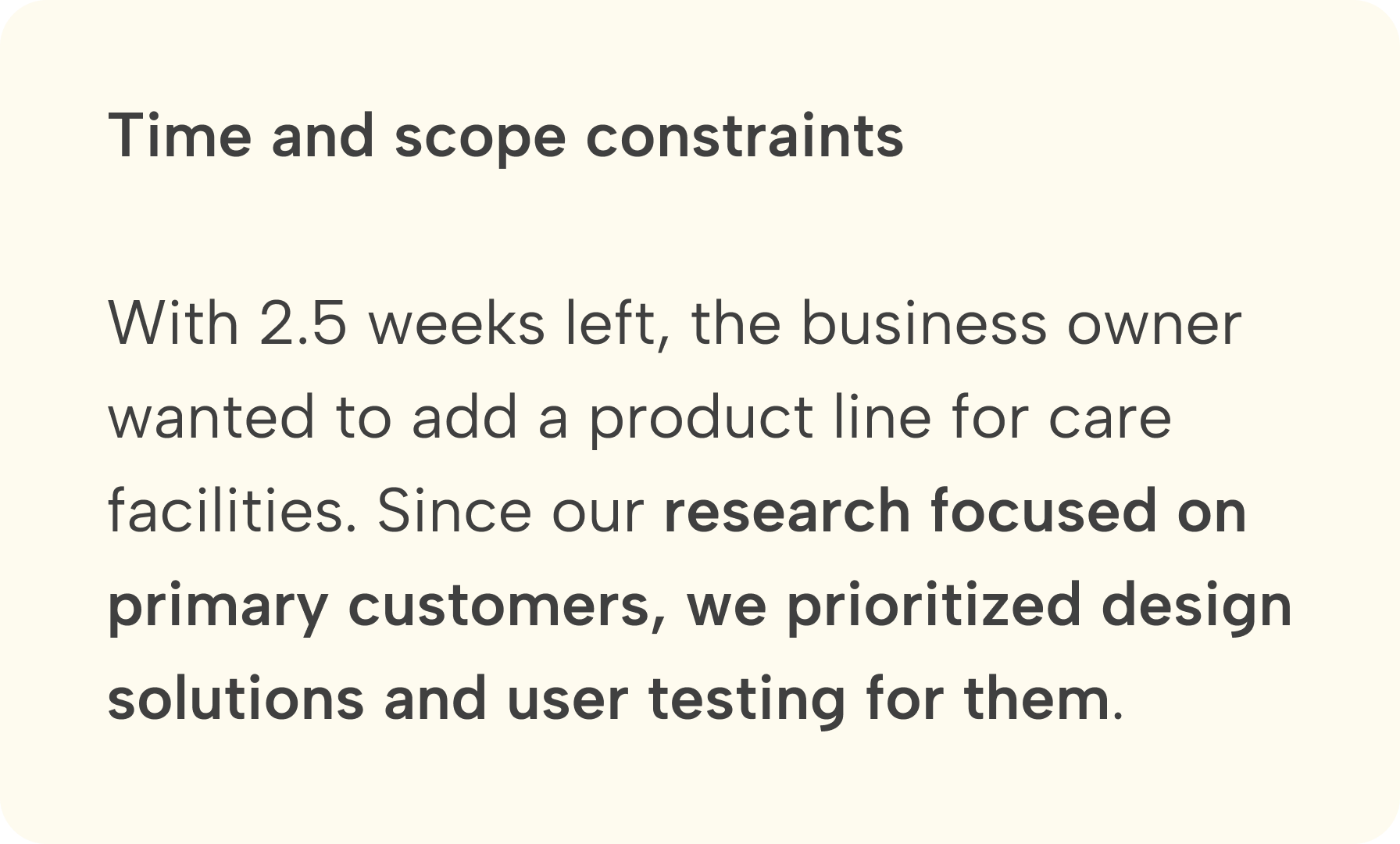
Midpoint Review
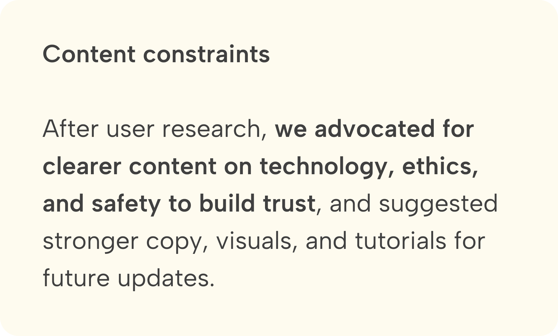
Changes, constraints, and solutions

IDEATE
Feature Prioritization
Finalizing essential features to meet user and client needs, while considering trade-offs
We collaborated with stakeholders to define features. User interviews showed users needed setup guidance, highlighting the value of a 24/7 virtual assistant. Due to time and technical constraints, we prioritized essential features for launch.

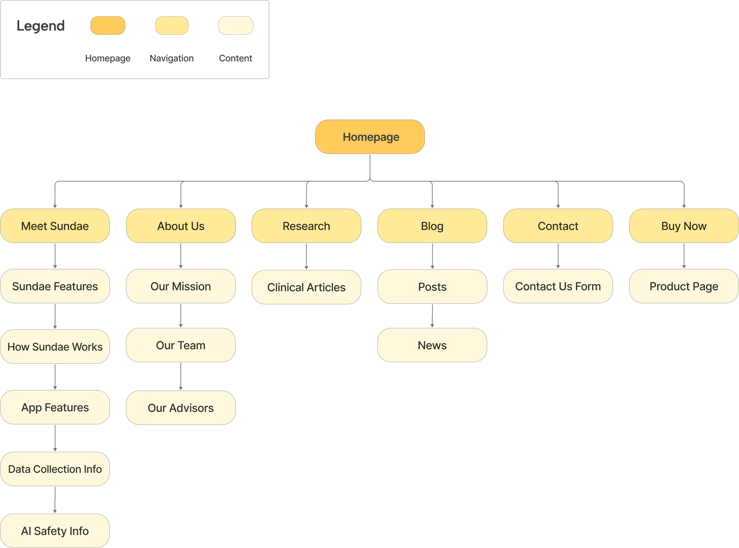
The original site overwhelmed users with a cluttered homepage and non-functional “Coming Soon” links. We streamlined the experience by restructuring the sitemap to simplify navigation and improve product discovery.
An updated sitemap to improve navigation
Information Architecture
DESIGN
How did we tackle the 4 key improvement areas identified in our user research?
Design Solutions
Overview:
1. Design: a style guide to ensure consistency and enhance usability.
2.Content & organization: improved content organization and navigation.
3.Shop page: clear product details, plans, and pricing in a streamlined layout.
4.Trust & credibility: new Meet Sundae, About Us, and Research pages.
1. Design
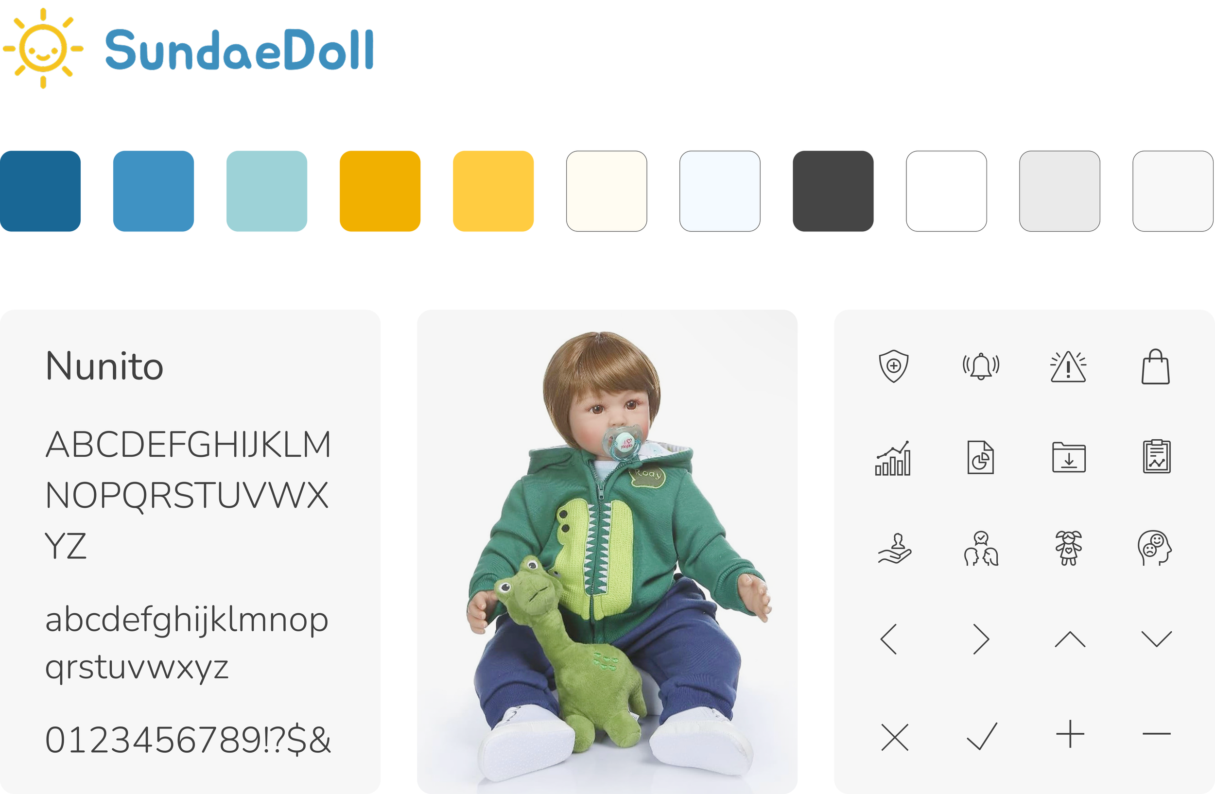
The UI prioritizes usability and accessibility with intuitive layouts, readable typography, and clear icons. Starting with just a logo, font, and two colors, we created a style guide, expanded the palette, and selected icons to establish a professional yet friendly tone, collaborating closely with the team.
2. Content & organization
I contributed to the homepage design and ensured consistency across different screens. The homepage presents Sundae with a clean, user-friendly layout that highlights key features and ensures easy navigation.
Lo-fi
Hi-fi

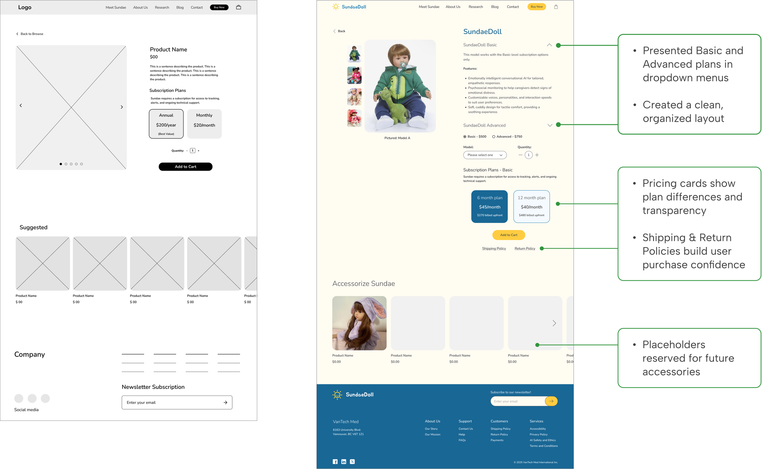
3. Shop page
For the product detail page, we we clarified details, plans, and pricing with clear headings, bullet points, and a streamlined layout to simplify navigation and the Add to Cart process.
Lo-fi
Hi-fi

We designed new pages: Meet Sundae, About Us, and Research to build credibility and trust by clearly detailing Sundae’s features, AI safety, doll therapy, clinical articles, and the team’s mission.
4. Trust & credibility
TEST & ITERATE
User Testing
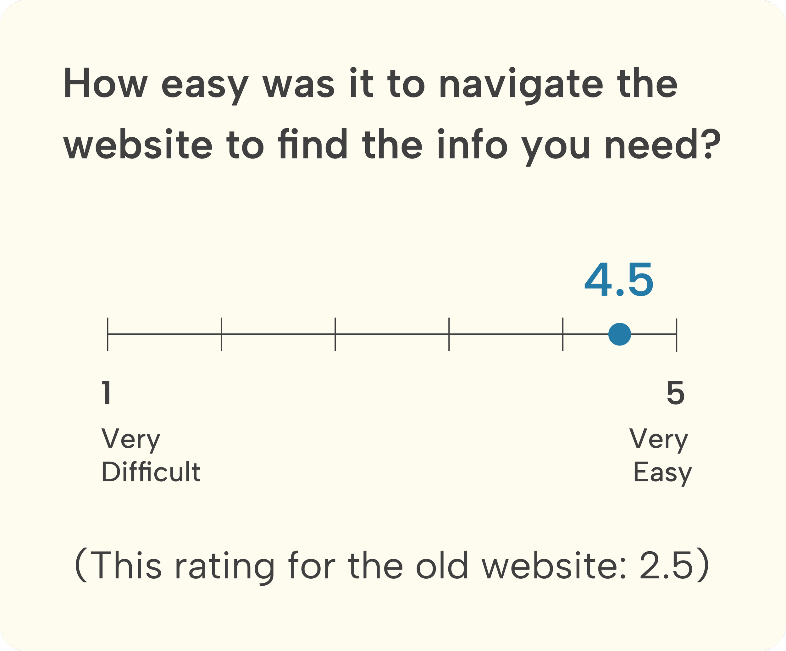
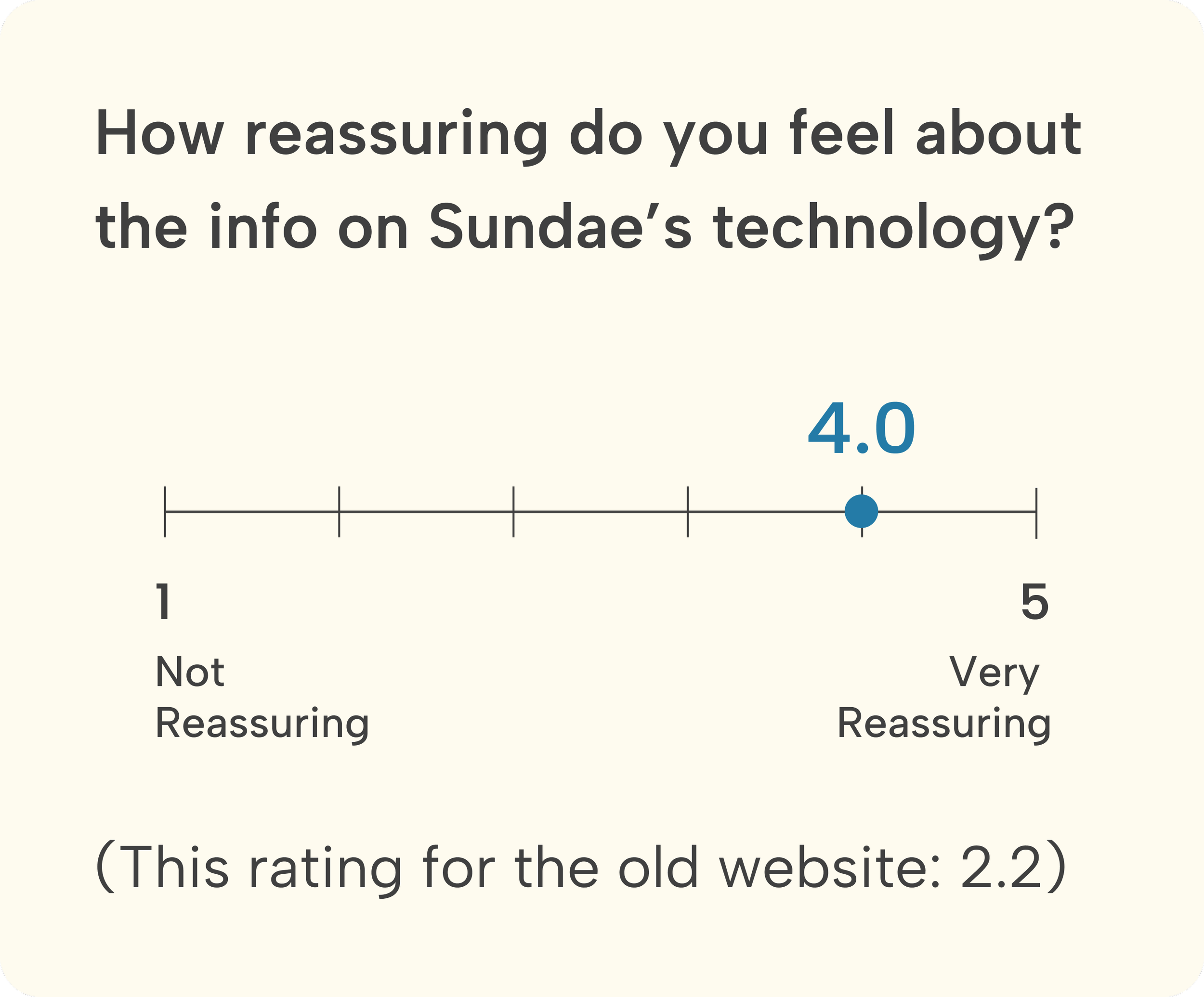
Testing navigation, user trust, and add-to-cart ease to improve the user experience
We tested the design with six users to uncover issues and improvement areas. The testing focused on the new navigation, user confidence after learning about the product, and the ease of adding a product to the cart.
Success Metrics
What went well?


Areas for Improvement
1. Homepage pricing section: clearer comparison of Basic vs. Advanced plans
After
Before

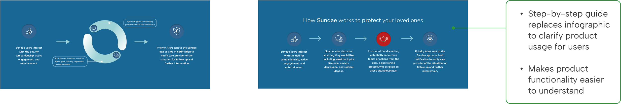
2. The How Sundae Works section on the Meet Sundae page was revised to address user confusion
After
Before
3. Transparent pricing for a more confident shopping experience
Before
After

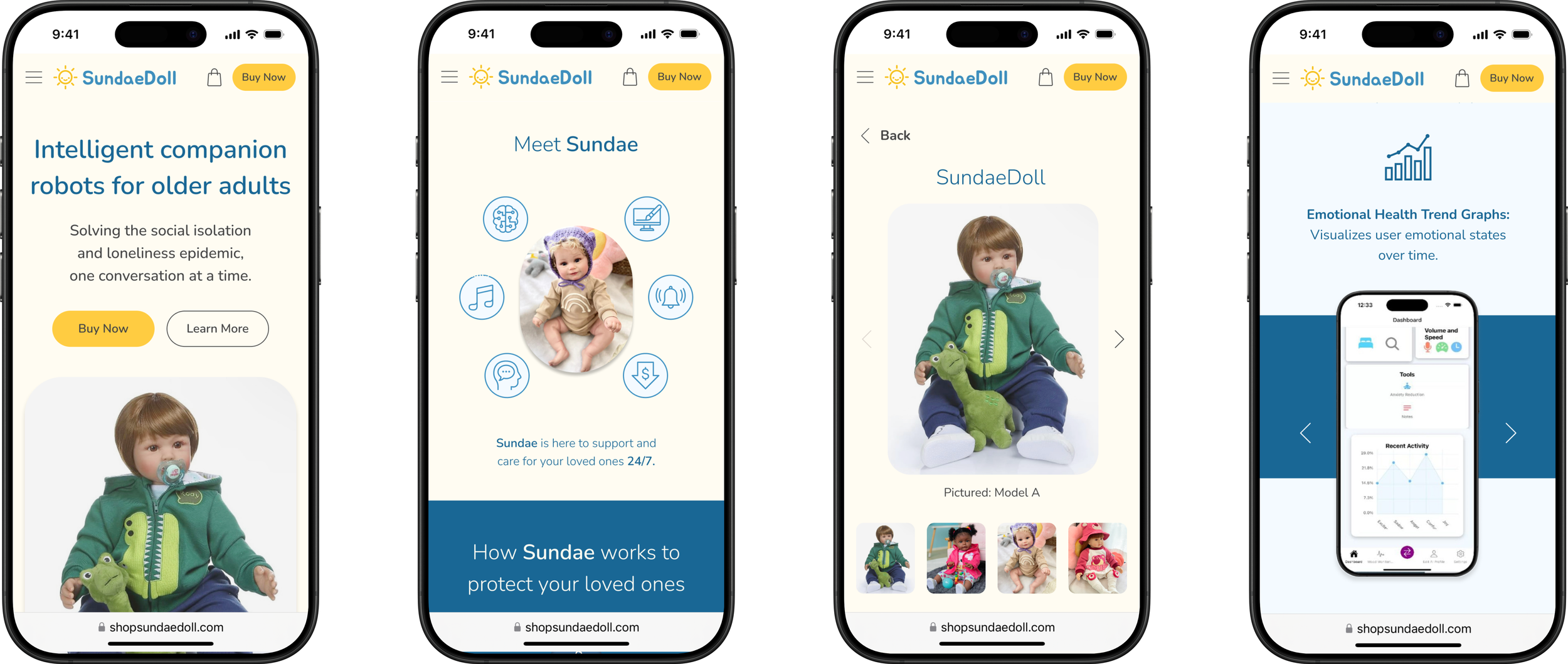
Responsive Design
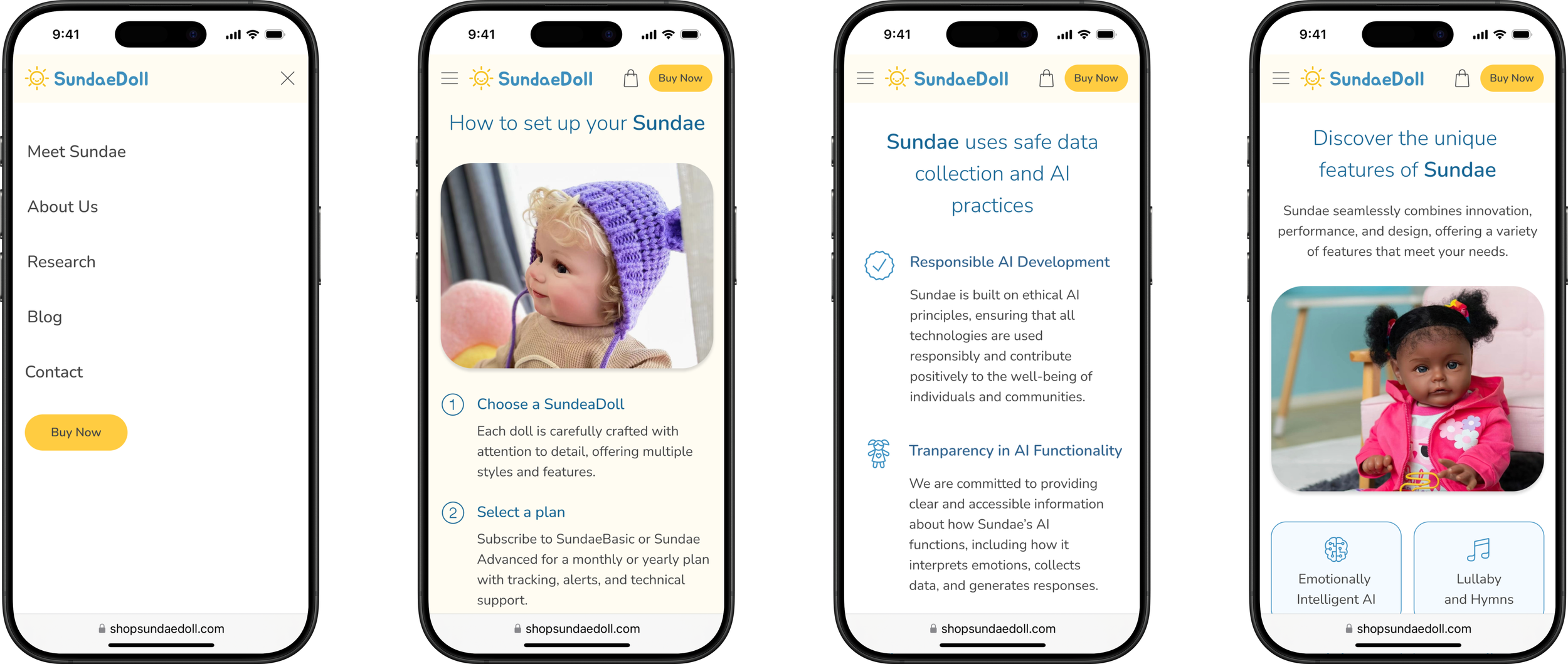
We designed for desktop and also created the mobile version of the key screens to demonstrate to the client how the design would appear on mobile, ensuring a seamless, responsive layout and user experience.
Mobile versions
UI Guide
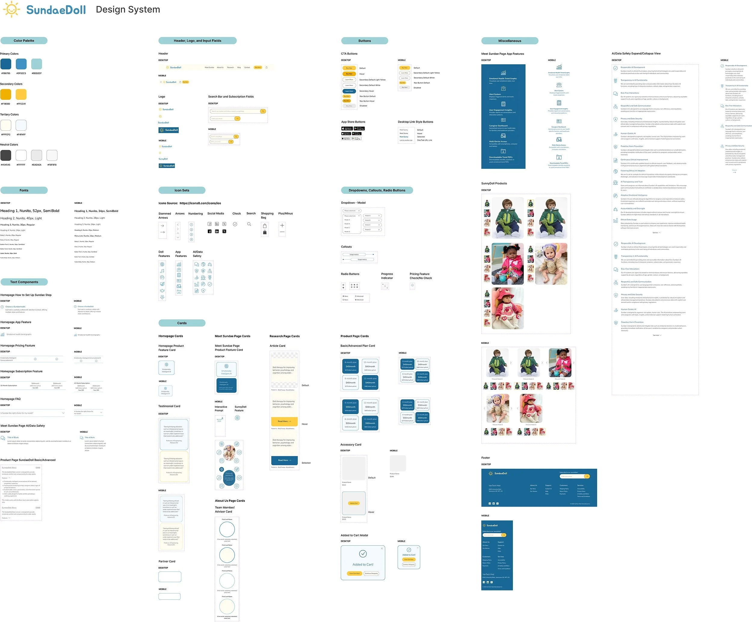
For the project handoff, we held a meeting with the developers to ensure a smooth transition. I led the organization of a clear, cohesive design system, giving the client a comprehensive reference for seamless implementation and future updates.
Design-to-development handoff
REFLECTION
What We’ve Accomplished
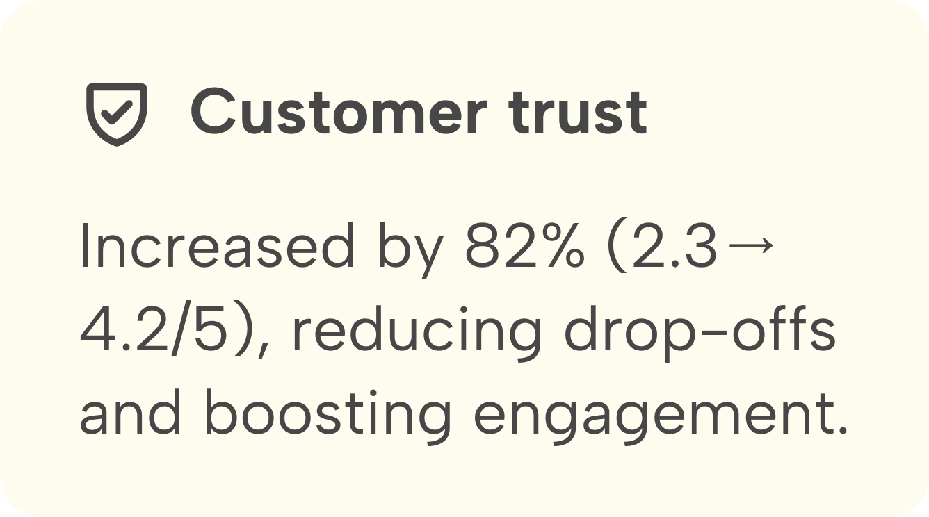
Customer trust: Increased by 82% (2.3 → 4.2/5), reducing drop-offs and boosting engagement.
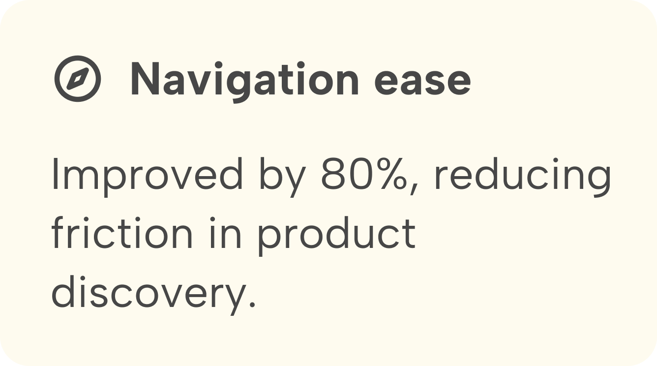
Navigation ease: Improved by 80%, reducing friction in product discovery.
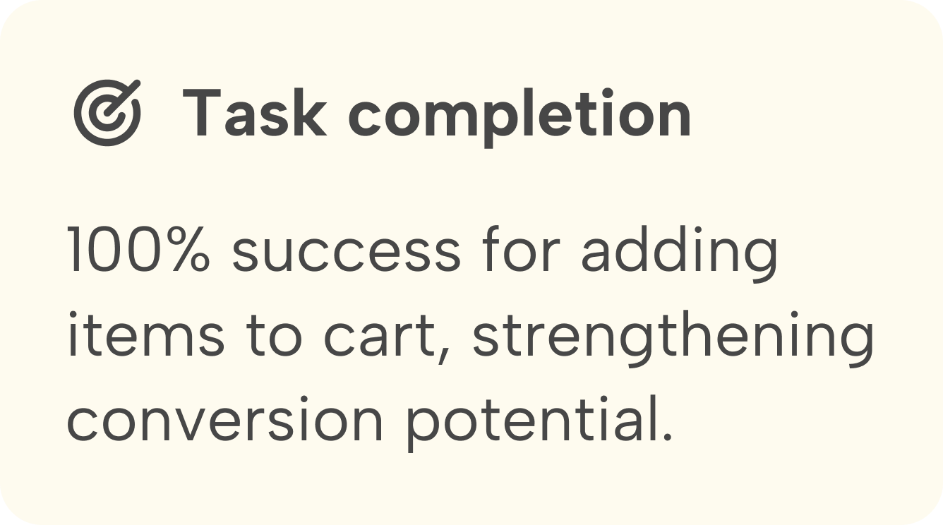
Task completion: 100% success for adding items to cart; ease-of-use improved from 1.8 → 4.8/5, strengthening conversion potential.
Lessons Learned
Collaborating with designers, developers, and stakeholders underscored the importance of cross-functional teamwork. I facilitated meetings with regular check-ins and clear communication to keep the team aligned across time zones.
Working with a startup, where priorities and requirements can shift quickly, taught me how to handle feedback, make adjustments as needed, and remain adaptable to change while maintaining the overall design vision.