A telehealth app helping pet parents in “veterinary deserts” connect with
licensed vets online, offering expert advice and peace of mind.
My Role
Product Designer
UX Researcher
Project Type
End-to-end
Mobile App
MVP
Tools
Figma
FigJam
Optimal Workshop
Timeline
6 Weeks
Skills
UX/UI Design, User Research & Interviews, Ideation, IA, Branding, Wireframing, Prototyping, User Testing
Pets are family - prioritizing their health
Context
OVERVIEW
Most Americans (62%) own a pet, and nearly all pet owners (97%) consider their pets part of the family (Source: Pew Research Center). While caring for a pet is incredibly rewarding, but it also takes ongoing effort. Pet parents are committed to ensuring their pets’ health and well-being.
Many areas in the US are considered "veterinary deserts," defined by poor accessibility, affordability, and provider availability (Source: The American Veterinary Medical Association). As a result, pet parents often face challenges in accessing timely help from veterinary professionals.
Pet parents are experiencing “veterinary deserts”
Problem
Solution
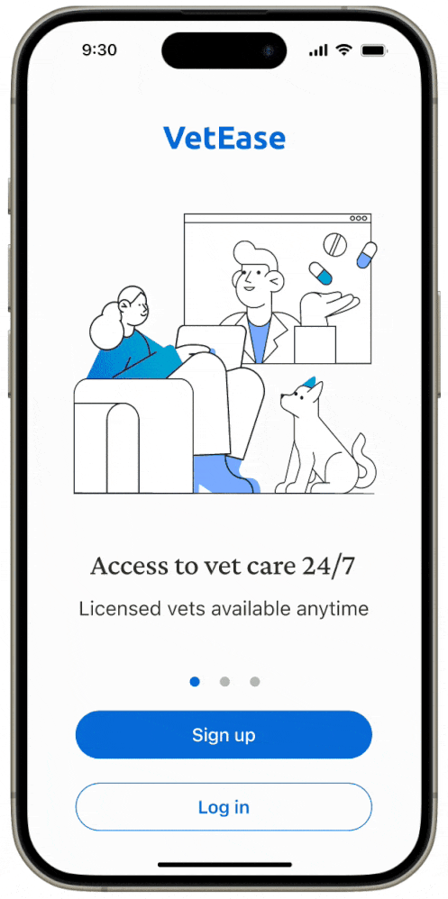
Accessible 24/7 online veterinary help
VetEase is a telehealth app that provides pet parents with 24/7 easy and quick access to licensed veterinarians via video call or chat. It offers immediate professional advice and an affordable per-appointment payment option.
or scroll down to view the full case study
RESEARCH
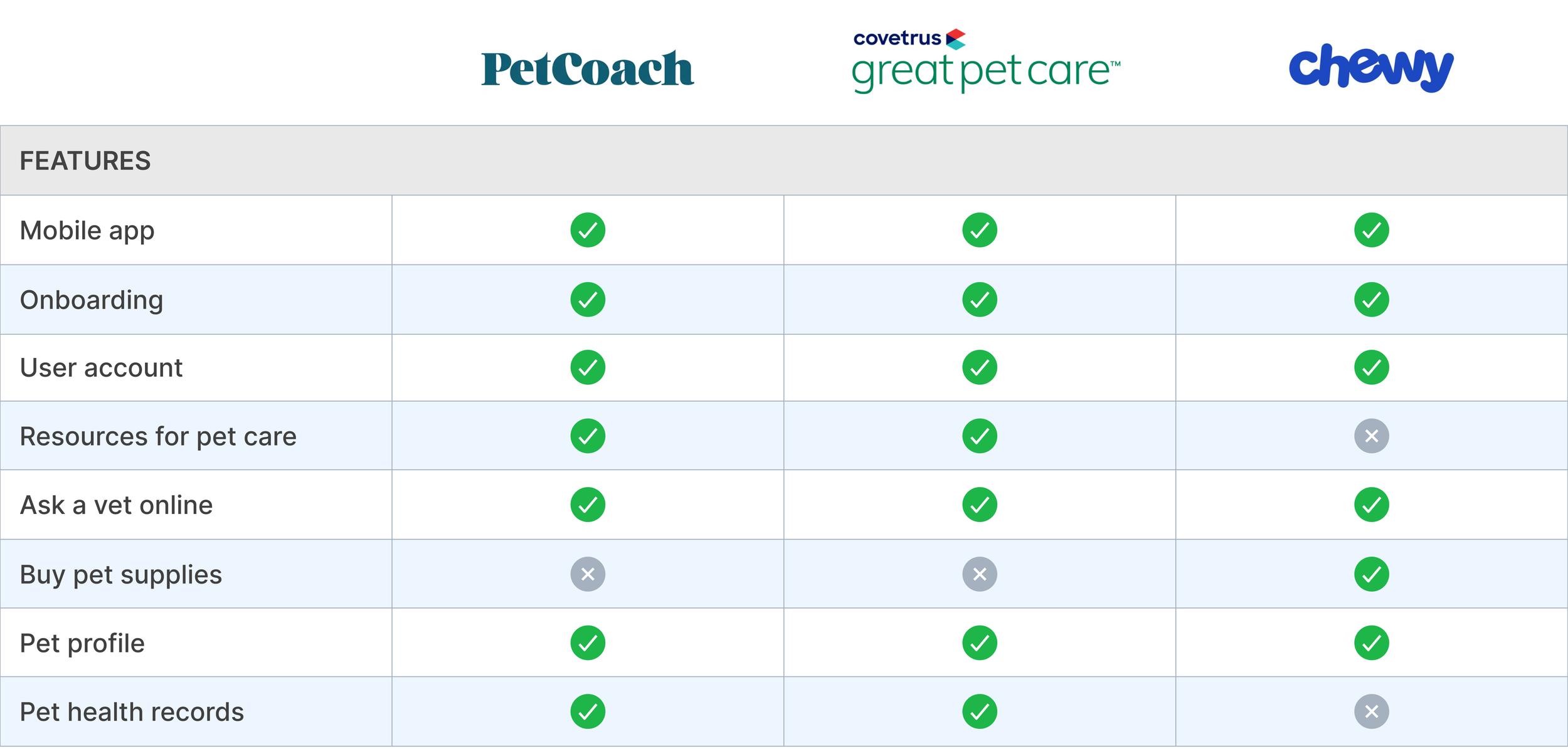
To better understand the pet care market, I conducted a competitive analysis of both direct and indirect competitors. A key insight is that pet care companies prioritize seamless access to online vets and pet profile management features.
What types of services do pet care companies prioritize?
Competitive Analysis
User Interviews
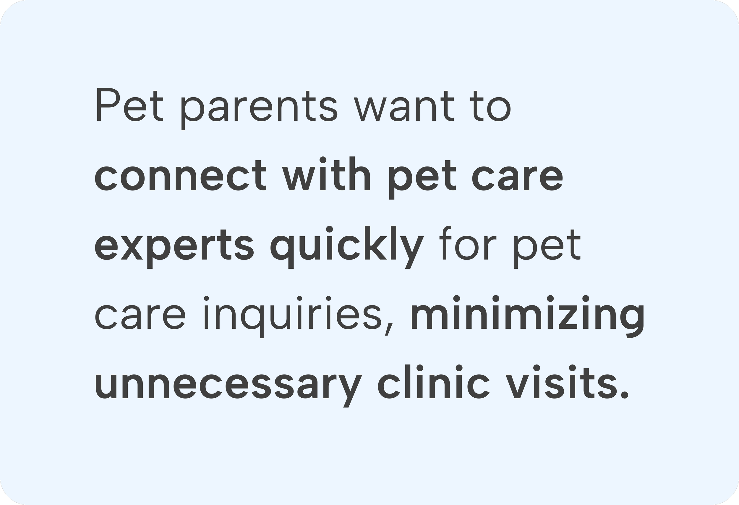
I interviewed five pet parents, aged 20s to 50s, to better understand the challenges they face in caring for their pets. These insights guided the development of a solution tailored to their needs.
Understanding pet parents
Key takeaways:


DEFINE
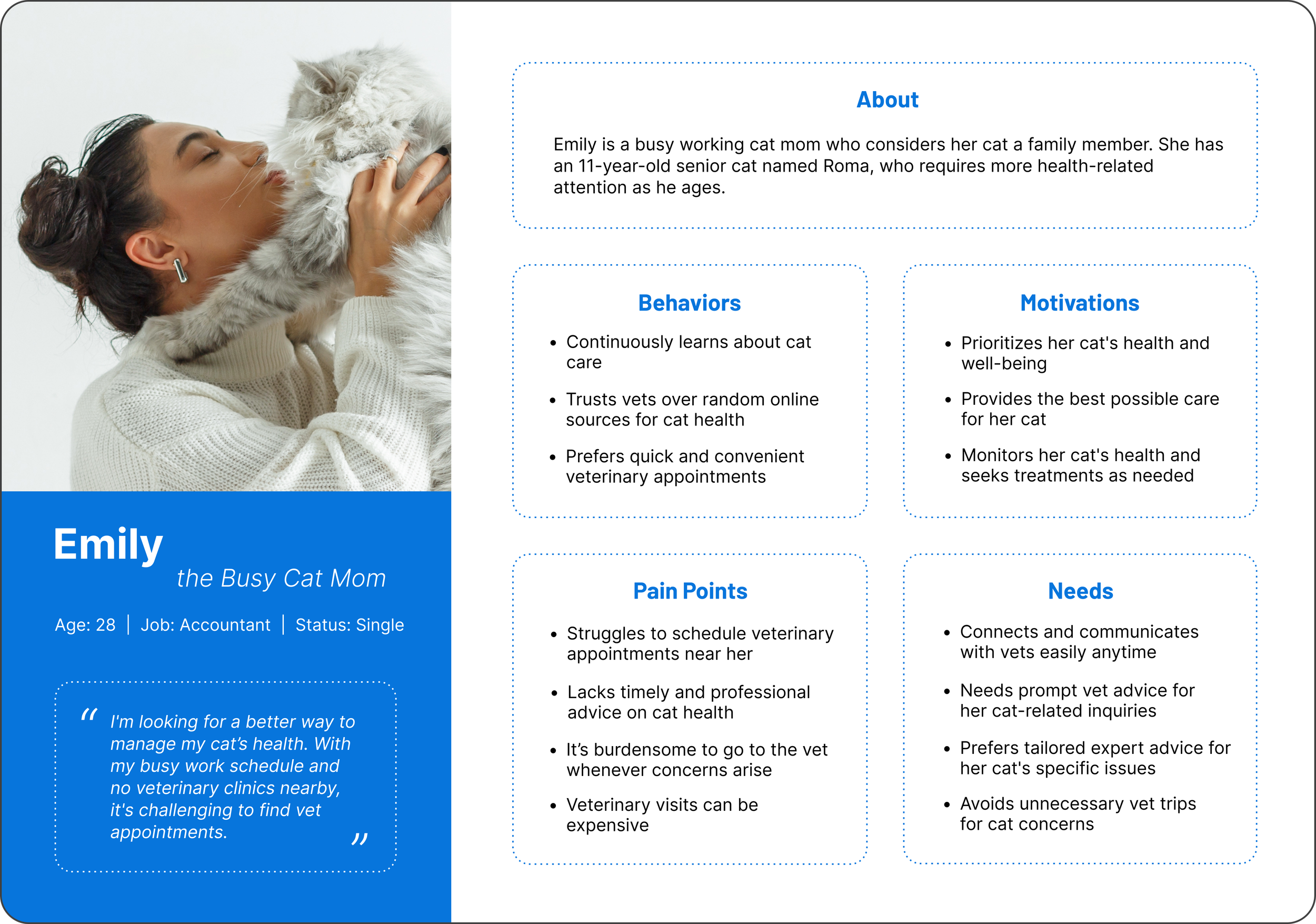
Persona
Understanding Emily: limited access, high need for virtual care
I created a persona for our target audience: Emily, a busy professional who struggles to find veterinary appointments near her. She faces limited accessibility and provider availability. As a result, she seeks quick and convenient access to online veterinary appointments.
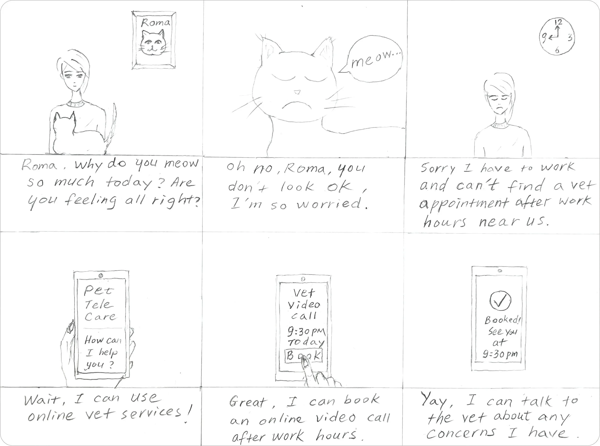
I sketched this storyboard to illustrate our persona’s primary pain point — difficulty accessing veterinary help due to limited provider availability, and how my proposed solution addresses it.
Illustrating Emily’s experience: from problem to solution
Storyboard
Brainstorming Solution
With our persona in mind, I sought solutions to alleviate their pain points and tackle challenges faced by pet parents in the next stage.
How might we help pet parents?
How might we streamline the connection between pet parents and veterinarians to provide prompt and professional advice, meeting the specific needs of pet parents and offering personalized guidance?
IDEATE
Information Architecture
Card sorting revealed four key user-defined clusters that helped shape the site map
I used open card sorting with 5 participants and 40 labeled cards to explore how users organize information. The results revealed four key clusters: Get Pet Care, Appointments, Pet Resources, and Pet Profile, informing the app’s site map.
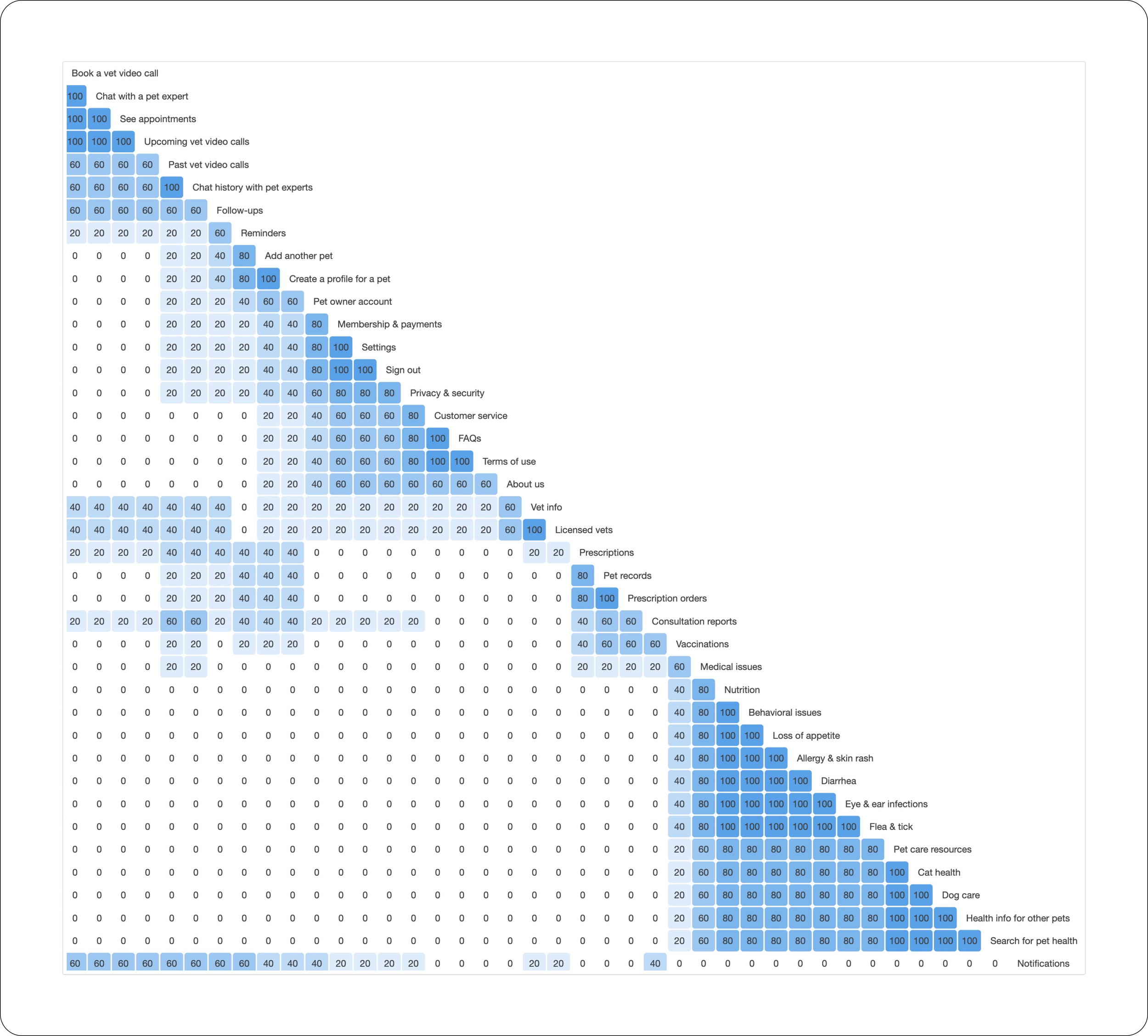
Open Card Sorting - Similarity Matrix
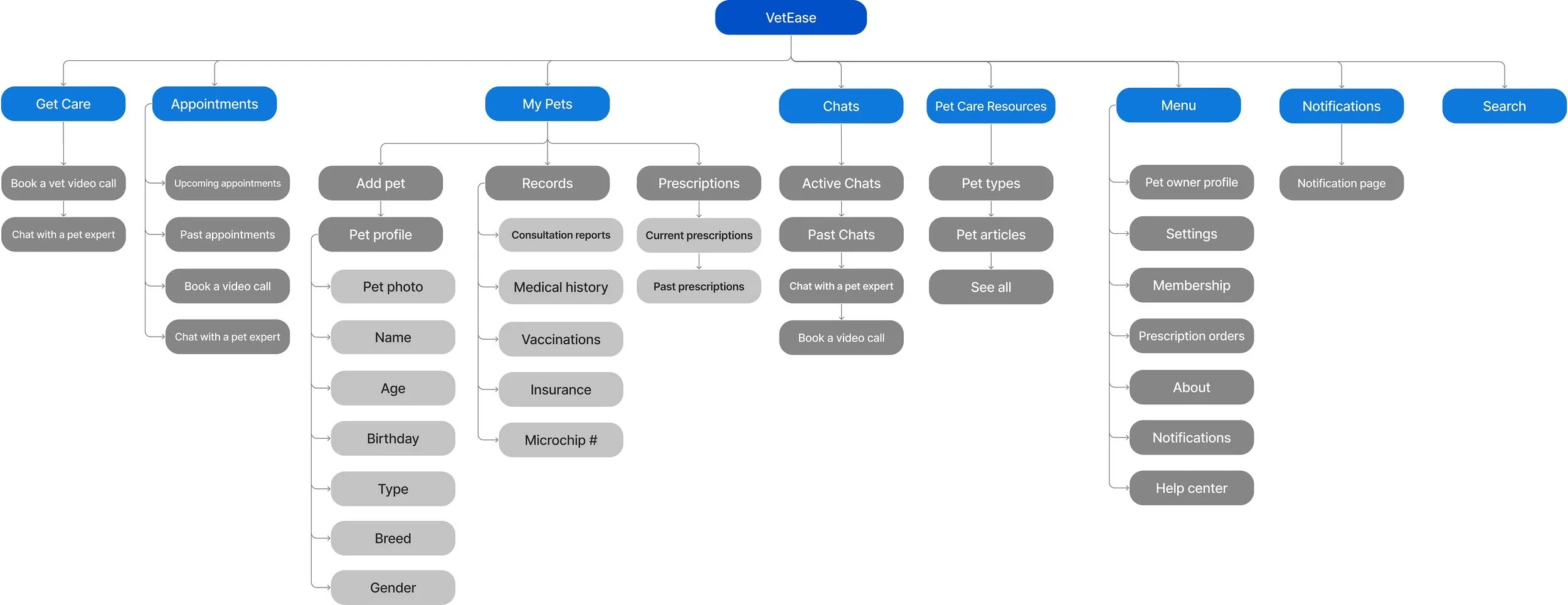
I enhanced the user experience for pet parents by structuring content into logical categories and introducing intuitive navigation, making information easier to access.
Organized content and intuitive navigation
Sitemap
Task Flows
Mapping the MPV flow: booking a vet video call
I illustrated the detailed action sequences needed to complete individual tasks for the MVP of booking a vet video call with payment, for both members and non-members, with a focus on making the process seamless and easy to follow.
Task flow 1: book a vet video call as a non-member


Task flow 2: book a vet video call as a member

BRANDING
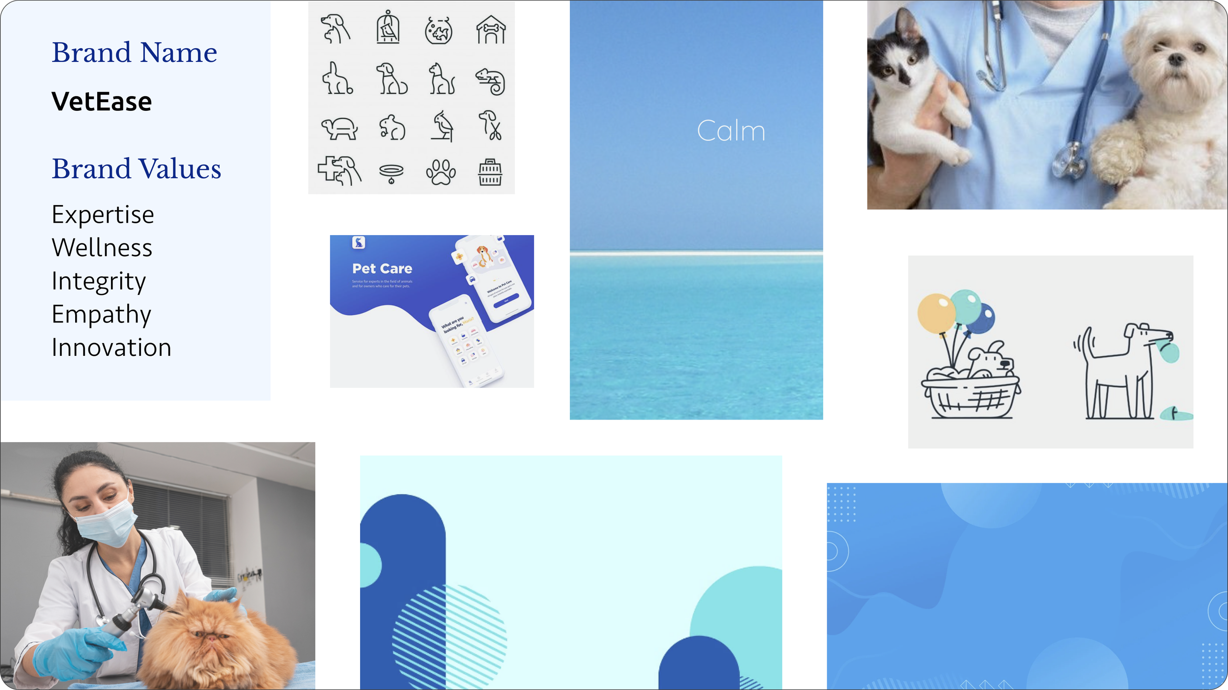
My goal was to give the pet healthcare app a professional yet calming look that embodies modern aesthetics while reflecting the five core brand values.
A modern design that embodies the brand values
Moodboard
I selected calming shades of blue, associated with healthcare, as the primary color. After experimenting with various designs, Design 1 became the app logo, while Design 2 represented the company's core services, symbolizing video calls and chats.
Identity of the pet telehealth company
Logo Explorations


The style guide streamlines VetEase's visual identity across platforms, ensuring consistency in reflecting brand values and fostering user engagement. Having the style tile as a reference helped me align the design with brand objectives.
Creating a cohesive visual identity
Style Guide
DESIGN
Design Solutions
A seamless experience for pet parents to get help
The app’s interface evolved from hand-drawn sketches to mid-fidelity wireframes, designed to guide pet parents through a seamless journey — from smooth onboarding to easily booking a video call with a vet.

Elevate visuals and enhance design
High-fi Wireframes
Guided by the style guide, I transitioned the wireframes from mid-fi to high-fi by refining visual hierarchy, UI components, and applying consistent styles. I designed intuitive screen flows with interactions aligned to user expectations for a smooth experience.

Seamless onboarding that introduces the app and makes signing in simple

Easily book a video call appointment and complete payment in just a few steps

Pet profiles designed to help pet parents easily manage their pets’ information
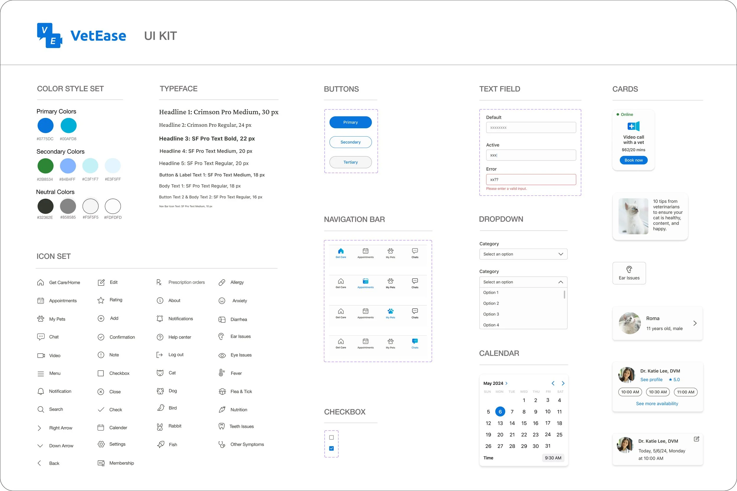
The UI kit encompasses a color style set, icons, typeface, and components was created to simplify the development process while ensuring a consistent user experience across different platforms.
A comprehensive kit for consistent design
UI Guide
TEST & ITERATE
User Testing
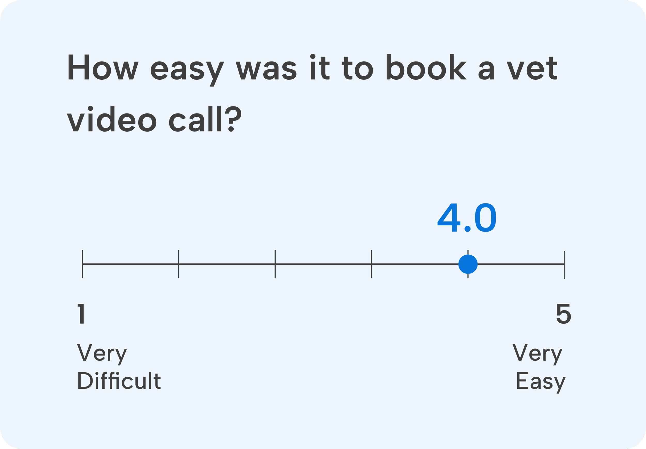
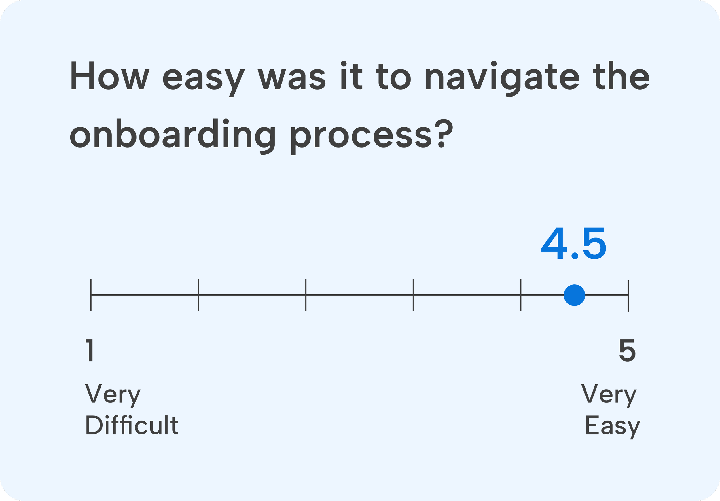
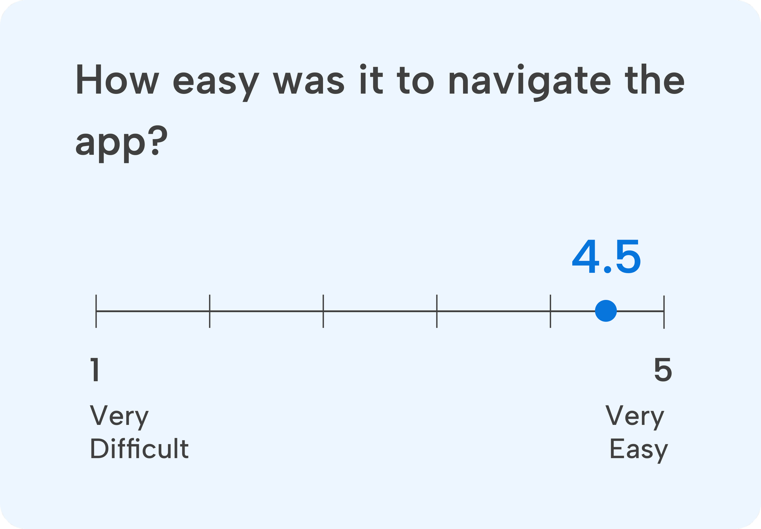
I moderated user testing sessions with five participants, both remotely and in person. This process was essential for evaluating my design by observing real user interactions and uncovering usability issues or areas for improvement.
User testing tasks:
Evaluate how easy it is to complete the onboarding task.
Assess the ease of booking a vet video call task.
Review the navigation and the overall design.
Observe, assess, and improve
Success Metrics
What went well?
Areas for Improvement
In response to user feedback and testing results, I implemented key revisions, aimed at optimizing features for enhanced effectiveness and user satisfaction.
Priority revisions
1. Making it easier for pet parents to find help
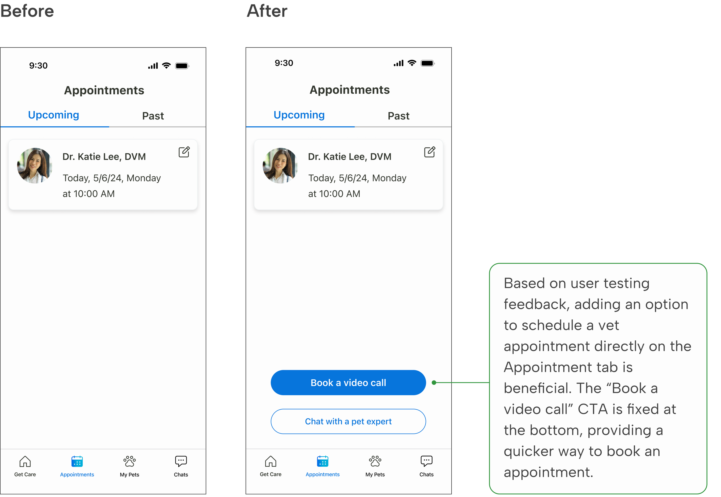
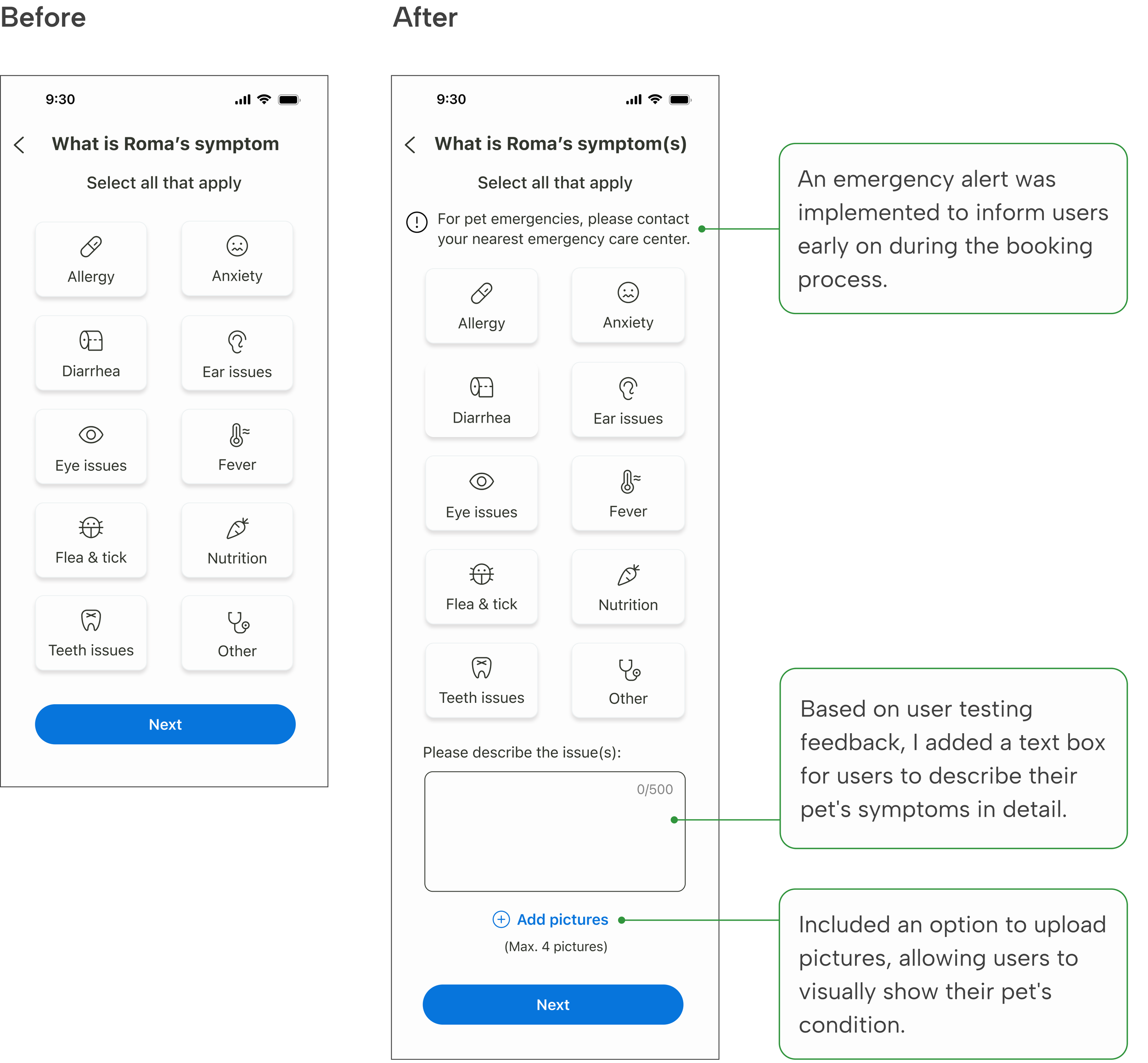
2. More options for describing and displaying symptoms

REFLECTION
The Chat service can be further developed to offer real-time support, ensuring users receive timely, personalized, and accurate assistance. Additionally, the Pet Care Resources feature can be enhanced to include expert-authored articles organized by pet type, effectively addressing pet parents’ need for trustworthy and relevant pet health information.
Next Step
Listening carefully to pet parents is crucial for understanding and addressing their needs and preferences. By empathizing with pet parents during user interviews and usability testing, I identified areas for improvement and create a more intuitive user experience, leading to higher satisfaction.
Prioritizing the needs of pet parents at every stage is important, and continuous iteration is key to enhancing our product. There's always room for improvement to refine the user experience.
Lessons Learned